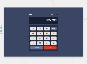
Design comparison
SolutionDesign
Solution retrospective
It was a bit tasky,lot of repetitive codes, nonetheless twas fun. Any opinion on how i can make my javaScript codes less and better?.
Community feedback
- @ChamuMutezvaPosted about 2 years ago
Hi Mustapha. Here is my observation:
HTML
- the first heading of a site should be an h1 element and the heading elements should follow a sequential order without skipping headings. Hence the
h3cannot be the first heading element. - use semantic elements , where interaction is involved do not use elements such as
p, div, span etc. The theme should have been radio buttons notpelements and the calculator should have buttons not span elements. Currently your calculator cannot be used by keyboard users.
js
- a calculator should have a maximum limit of numbers that it can take not one that can take an number that a user can punch in.
- I do not expect a calculator to accept the following
.........566663.×3++++++---undefined26++98Press equal sign first
- try the following calculations
0.2 + 0.1
Marked as helpful1@Farouk-ayoPosted about 2 years ago@ChamuMutezva Thanks a lot Chamu .Have made corrections on those semantics elements. I'll work on on those Js functionality u stated and the usage of keypresses too.
1 - the first heading of a site should be an h1 element and the heading elements should follow a sequential order without skipping headings. Hence the
Please log in to post a comment
Log in with GitHubJoin our Discord community
Join thousands of Frontend Mentor community members taking the challenges, sharing resources, helping each other, and chatting about all things front-end!
Join our Discord
