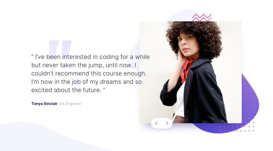
Design comparison
Solution retrospective
I had a lot of trouble with the positioning and child/parent height relationships. Ended up having to use width: 100% for the html and body elements.
I also need a better way to position the buttons. I tried but could not anchor them to where I'd like it to be and have the position scale with the page size.
If someone could take a look at my html/css and give me some pointers, I'd greatly appreciate it.
Community feedback
- @GerbenDolPosted over 4 years ago
Hey Jackie! Overall it's looking great!
I think you should really just dive a bit deeper into how setting position absolute affects the element.
In this case you'd want a div around your image that is
position: relative;and also has your absolute element in it.This way the absolute is always relative to the dimensions of the image and it's easy to always display it at the bottom-left with a little offset!
0
Please log in to post a comment
Log in with GitHubJoin our Discord community
Join thousands of Frontend Mentor community members taking the challenges, sharing resources, helping each other, and chatting about all things front-end!
Join our Discord
