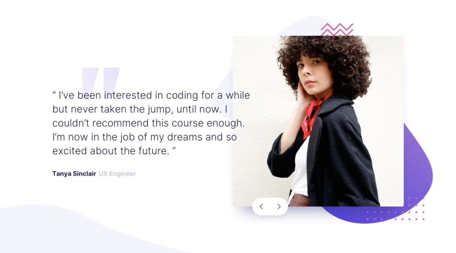
Design comparison
Solution retrospective
The position of the background and the text aren't really centered, any advice?
Community feedback
- @grace-snowPosted over 3 years ago
Well done - Matt's covered all the same stuff I would've said 😃
Other things to look out for:
- It's not great practice to be resizing the font to small percentages at lots of breakpoints like you're doing now. That can cause big problems for people relying on different zoom settings / assistive tech to access a site. And no need to do it really.
- maybe consider using blockquote element for the testimonials (optional)
- remember to add visible focus states, and optionally hover, to those next/previous buttons once you've swapped them for interactive elements as Matt suggested.
Really great that you had a go at this one 👍
0@Jerico001Posted over 3 years ago@grace-snow Thankyou for your feedback and advice :). I’ will be sure to learn from your advice and improve myself
0 - @mattstuddertPosted over 3 years ago
Nice work completing this challenge, Jerico! I know you weren't sure about the carousel, so it's good to see you managed to get something working.
Here are a few thoughts:
- I'd recommend avoiding setting click listeners on non-interactive elements, like the
imgelement. These can't be accessed by anyone not using a mouse/trackpad to navigate the content, which is a bad practice. Instead, add click listeners to interactive elements likeaorbutton. This will ensure the element is focusable and accessible by people not using a mouse/trackpad. - You're currently using
imgelements for background images. I'd recommend using thebackground-imageproperty in your CSS instead and usebackground-positionto position the images. - I'd recommend reviewing the responsiveness of your solution. Especially at the large mobile / small tablet sizes. As a front-end developer, it's a major goal to get the content looking good on a wide range of screen sizes.
Keep it up. The more you practice, the more you'll improve. I hope those tips are helpful! 🙂
0@Jerico001Posted over 3 years ago@mattstuddert Thank you so much for your tips, learned a lot and will surely use those tips and avoiding the same mistakes on the next project! :)
0 - I'd recommend avoiding setting click listeners on non-interactive elements, like the
Please log in to post a comment
Log in with GitHubJoin our Discord community
Join thousands of Frontend Mentor community members taking the challenges, sharing resources, helping each other, and chatting about all things front-end!
Join our Discord
