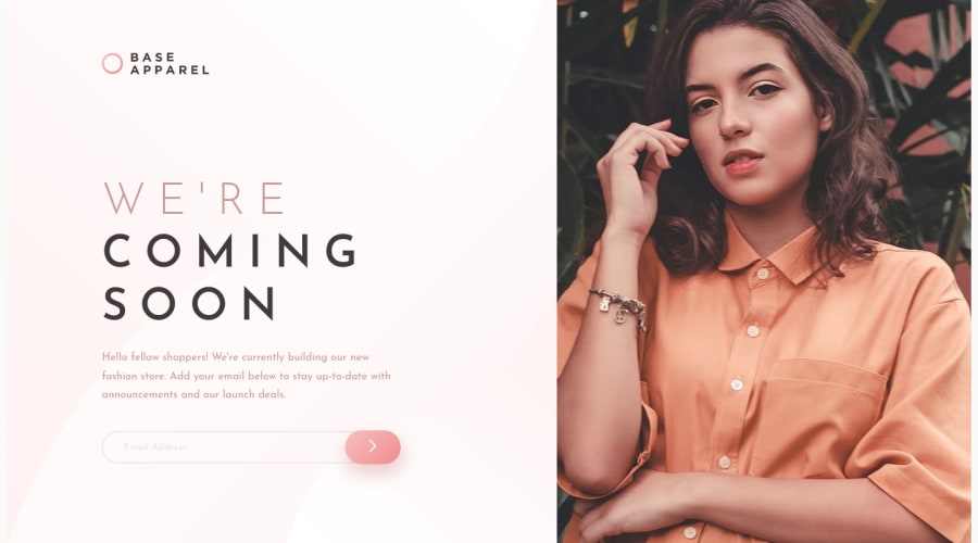
Design comparison
Solution retrospective
It should be like a tricky challenge but seems like not that tricky. #EzPzLmnSqz
Check it out and leave your comment.
Community feedback
- @AgataLiberskaPosted over 3 years ago
Hi @DevilDoctor27! Well done on this challenge, looks really nice! Just make sure you add aria-labels to your input and submit button (as per the report above).
If you wanted to add extra challenge, you can make this component full-screen - this would mean managing how the image resizes on smaller and larger screens. You could also add email validation on typing (what I mean is when I get an error and then correct the email address, it would be good for the red border and error icon to go away so that I know that it's ok now).
Happy coding!
1@volod-onePosted over 3 years ago@AgataLiberska Thank you for your review.
I've completed another one chellenge which include little bit part with validation. https://www.frontendmentor.io/solutions/html-css-javascript-flexbox-LlAHWKxT4
0
Please log in to post a comment
Log in with GitHubJoin our Discord community
Join thousands of Frontend Mentor community members taking the challenges, sharing resources, helping each other, and chatting about all things front-end!
Join our Discord
