Design comparison
Community feedback
- @grace-snowPosted about 2 months ago
I've already left a lot of feedback on your blog card solution so won't repeat things here.
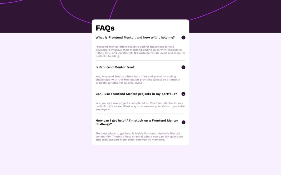
But this challenge also needs changes. The whole questions should be inside the buttons, not just the icons.
This is an accordion challenge, which means it is a set of disclosures. These have very specific accessibility requirements that you must follow. See the article here for essential changes needed https://fedmentor.dev/posts/disclosure-ui/
Once you've fixed the markup you should change the JS too. Loop over all the buttons and add event listeners to run a function. That function should change the aria expanded attribute and optionally a class or data attribute to manage the visibility of the answer. The same single function should run on click of any of the buttons. Remove all onclicks in the html and rely on the one short js function instead.
Marked as helpful0
Please log in to post a comment
Log in with GitHubJoin our Discord community
Join thousands of Frontend Mentor community members taking the challenges, sharing resources, helping each other, and chatting about all things front-end!
Join our Discord
