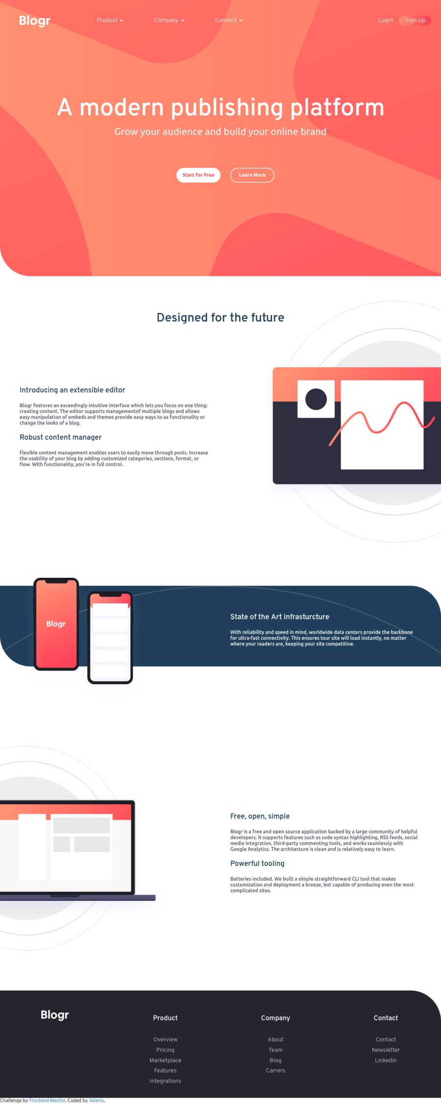
Design comparison
Solution retrospective
This is my first completed challenge and would love to hear your feedback.
Also I am interested to get some tips how to position the background images to look like in the original design.
Community feedback
- @ApplePieGiraffePosted over 3 years ago
Hello, Valeriu! 👋
Congratulations on completing your first Frontend Mentor challenge! 🎉 Good effort on this one! 👍 I like how you made the navigation sticky! 😀
A few things I suggest are,
- Turning the various navigation links on the page into actual links using the anchor tag.
- Adding a heading to each
<section>tag that you use to identify that section and improve the semantics in your solution. - Adding the dropdown menus in the header navigation of the page would be a good idea! 😉
I haven't completed this challenge yet, but you might be able to position the background image (in the hero section of the page) to look more like the original design by leaving it at its original size and playing around with the
background-positionproperty (perhaps try using fixed values, like px or rem, or viewport-based units, IDK). 😅Keep coding (and happy coding, too)! 😁
1@valy-sPosted over 3 years ago@ApplePieGiraffe Thank you for feedback, will work on your suggestion and try to improve my solution.
0
Please log in to post a comment
Log in with GitHubJoin our Discord community
Join thousands of Frontend Mentor community members taking the challenges, sharing resources, helping each other, and chatting about all things front-end!
Join our Discord
