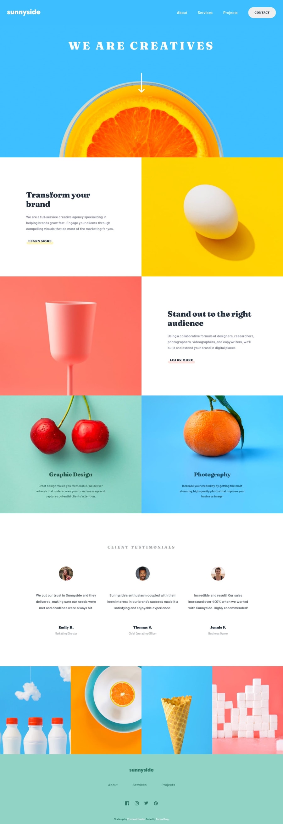
Design comparison
Solution retrospective
Hi Everyone,
I finished my first project with FrontEnd Mentor! It took me longer than I had anticipated. Making it responsive required more code than I had expected (My approach was desktop-first, so I'm sure that was part of the reason.)
I would appreciate your feedback on a couple of issues:
- The screen reader skips the h2 titles. I thought h2 elements are tabbable by default.
- The menu links in the sidebar do not link (when clicked) to the section they are referencing. Of course, if you notice any other issues, please do let me know. Many thanks!
Corina
Community feedback
- @AtlasKaplanPosted over 1 year ago
Hi Cor-Ina, I was able to check out your webpage, and I really liked what I saw and learned a lot! Especially the interactive menu and the correctly scaling images (which is why I had to set the media query quite high). Thank you so much for taking the time, and what I can contribute is to make the fonts a bit larger (especially for the menu) and the images in the testimonial section. Also, adding a couple of responsive gaps when scaling the page, but other than that, I loved it! I'll apply what I missed and continue improving it as much as I can. Wishing you the best of luck, and I look forward to seeing more projects and sharing feedback!
Marked as helpful1@CorinaMurgPosted over 1 year ago@AtlasKaplan Hi Atlas, I made some changes, so I think it looks better now. Thank you mentioning the gap elements (I had forgotten I could use gaps with a flex model!). I included them in the testimonial section and it behaves better now. One feature that you might be interested in is changing the color of a svg picture. I did it in two different ways:
- go to svg file, the path element all the way at the end has fill="some color name" and change the color (I used this for the footer logo)
- instead of changing the color, do fill="current color", and then set the color with css (for a hover effect) svg { color: white; } svg:hover { color: black; } This does require that you use <svg> and not <img> in your html (al least, I wasn't able to get it to work with <img>).
Thank you again for taking the time to look at my code. I look forward to see your future projects. Corina
1 - @forjoaPosted over 1 year ago
Hi, Corina! I just view your site, it was awesome to see some changes like the header and the hamburguer, the only thing that I noticed kind of diferent was the size of the text, but the other things are perfect! Joaquin.
1@CorinaMurgPosted over 1 year ago@forjoa Thank you Joaquin! I changed the font, and it's now closer to the original design. I have also changed the hamburger menu, and simplified some of the code. Thank you again for your feedback! Corina
0
Please log in to post a comment
Log in with GitHubJoin our Discord community
Join thousands of Frontend Mentor community members taking the challenges, sharing resources, helping each other, and chatting about all things front-end!
Join our Discord