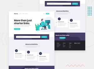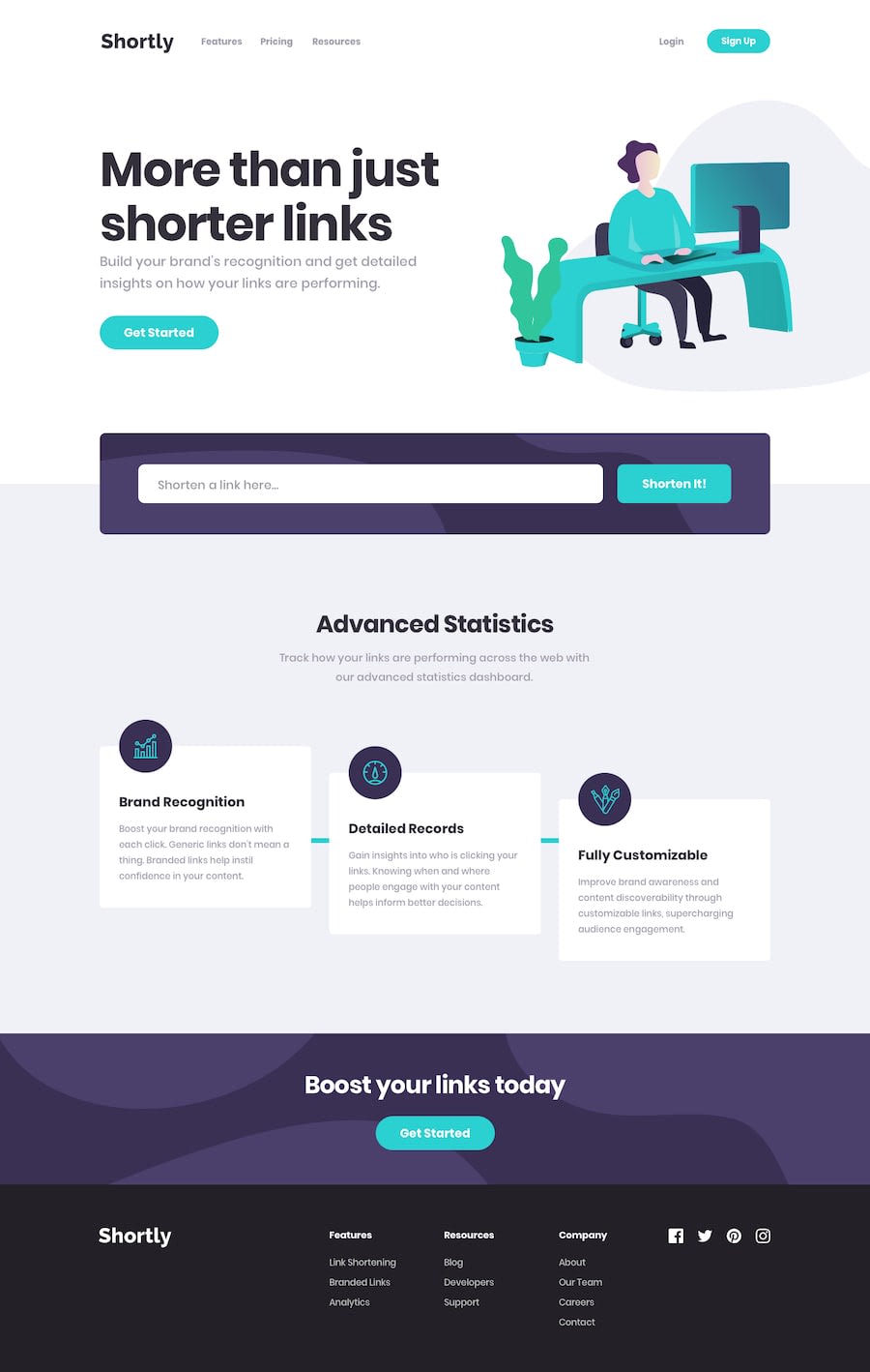
Design comparison
Solution retrospective
This was a fun project. I practiced using BootStrap a little more and it certainly helps.
- I used Bootstrap for the navbar and noticed that the transition isn't as smooth and a little flickery, I was hoping someone knew what I can change to make it smooth?
- I wanted to simulate a loading element and I added the gif into my HTML and simply added a hidden class that toggles with JavaScript. I was wondering if there is a more efficient way of implementing a loading gif or something similar.
- I also added a delete button in case the screen gets too full with Link cards and there was no way to remove them since they save even after the page is refreshed.
- Is it common for sites to have headings only increase by one? I've seen how sometimes larger headings comes after smaller headings in some sites and I was wondering what is the common practice for that? Would a developer use an h2 with smaller font size and then use an h3 with a larger font?
Let me know if you have any tips/suggestions/spotted bugs. Thanks!
Community feedback
- @dwhensonPosted about 3 years ago
Hey @Carlos-A-P great job here - this one is a tricky one!! 🙌
Here's a few things to think about, in response to your points:
• I think the transition is flickering as you/Bootstrap is changing the height of the open panel. Animating this property demands a lot of the browser, if you change to opacity or just a transition in from somewhere you should be OK. I don't know Bootstrap, but it seems it is somehow adding the value inline, then removing once the transition is complete
• For the loading element, at the moment it stays after the fetch request is complete. It should be removed. You can actually create these kind of effects with pure CSS which might be easier and lead to less disruption on the page. I changed the content of the fetch button content on my attempt to try and address this.
• It might be worth having another play around with the API here. As there are two levels of failure, 1) if there is an error in response (which you have covered), and 2) if the url requested cannot be shortened. At the minute if I try the second on your page it just hangs.
Try shortening
www.shrtco.deto see how this error manifests itself. It took me a while to deal with this issue, but the API has some good built in error messages that you can catch and provide in the user error message.• For headings, I think the answer is yes, what this means is that you should use the <h1> headings as main heading of your web page, followed by the <h2> headings, then the less important <h3> headings, and so on, without skipping a level.
This is really important as many people using assistive tech to access your pages will navigate the site based on the heading structure.
I approach this by first laying out the page using only HTML and only thinking about the document structure, not design at all, and then once done returning to the page and using CSS to make things look how they should.
We shouldn’t use headings to make text look BIG or bold. Use them only for setting out the heading of your document and to show the document structure, and then change things up with CSS after that.
Hope this helps - great stuff on a very challenging one!! 👍
Cheers 👋
Dave
Marked as helpful3
Please log in to post a comment
Log in with GitHubJoin our Discord community
Join thousands of Frontend Mentor community members taking the challenges, sharing resources, helping each other, and chatting about all things front-end!
Join our Discord
