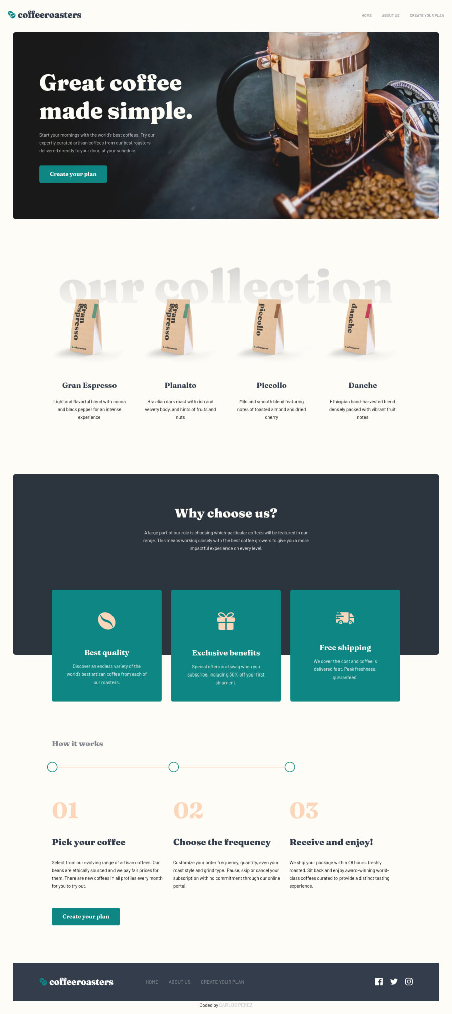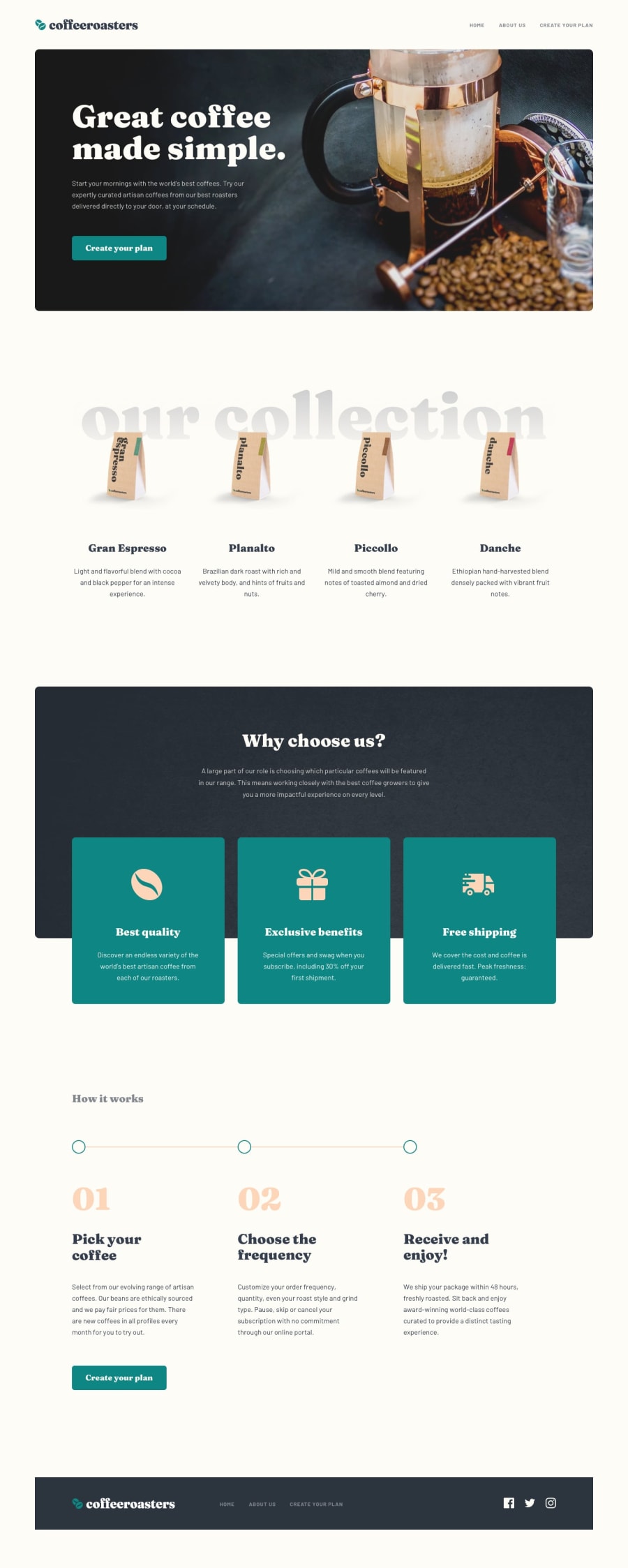
Design comparison
SolutionDesign
Solution retrospective
This was a very tough challenge. I tried to focus mostly on accessibility and function over transitions so I'd appreciate any feedback/tips/bugs you may spot in the website.
- The most difficult part was setting up the accordion correctly. I used a lot of button elements for this but I was wondering if I should have wrapped the accordion with a form tag.
Community feedback
- @MarlonPassos-gitPosted about 3 years ago
I really liked your solution, it must have been a lot of work, some suggestions:
- users are kind of used to clicking on the website logo and being directed to the home, it would be nice for you to implement this
- Another thing that would be nice is to click on the sides when selecting the product and automatically open the card
- You could have hidden the content using a Details & Summary tag, it would be more sematic and maybe even easier to work with.
- locations and social could be a <ul>
- And each location could be an <adress>
Marked as helpful0@Carlos-A-PPosted about 3 years ago@MarlonPassos-git Thanks for the feedback. These are some really good suggestions and I didn't even think to use other tags aha, thanks! I appreciate you taking a look.
1
Please log in to post a comment
Log in with GitHubJoin our Discord community
Join thousands of Frontend Mentor community members taking the challenges, sharing resources, helping each other, and chatting about all things front-end!
Join our Discord
