Design comparison
SolutionDesign
Solution retrospective
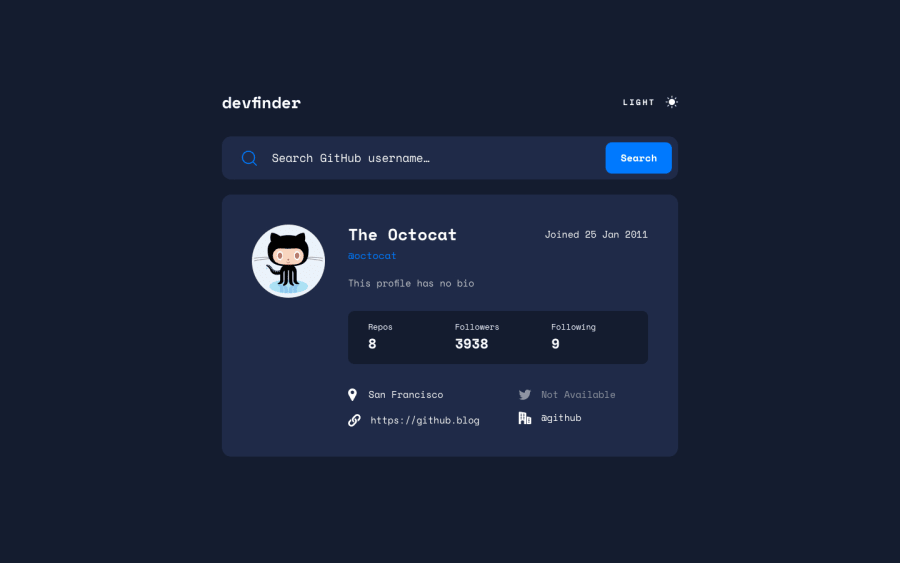
I'd appreciate any feedback or thoughts on this project. The one thing I wasn't able to do was to add the three dots (...) very close together in the input placeholder. Is it possible to make the dots very close together like the end result?
Community feedback
Please log in to post a comment
Log in with GitHubJoin our Discord community
Join thousands of Frontend Mentor community members taking the challenges, sharing resources, helping each other, and chatting about all things front-end!
Join our Discord
