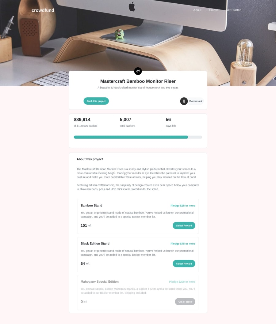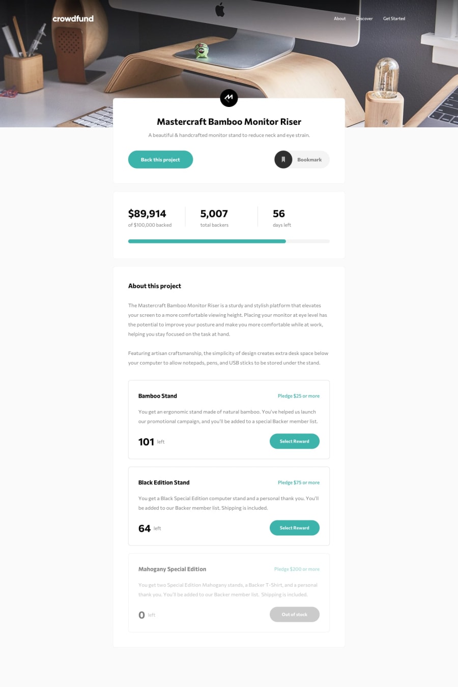
Design comparison
Solution retrospective
After watching some video tutorials on Bootstrap I became really motivated to apply my knowledge to a project. I had a lot of fun with it and learned a lot, especially with Bootstraps grid system and modals. I also used JavaScript to increase the backers number and the progress bar after a donation. For the mobile navbar I used the default Bootstrap behavior and it´s okay for me. I would be happy for some feedback :)
Community feedback
- @just-a-devguyPosted almost 4 years ago
I really love the way you build this project. I cannot honestly find something worth complaining or a nit to pick about this. It is responsive, the animation delays are great, hover effects are amazing. The bookmark state transition is solid. All around great job! I'm sure there might be some underlying thing to improve on but to a user, I cannot find it. :)
0
Please log in to post a comment
Log in with GitHubJoin our Discord community
Join thousands of Frontend Mentor community members taking the challenges, sharing resources, helping each other, and chatting about all things front-end!
Join our Discord
