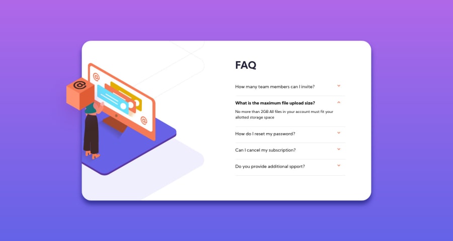
Design comparison
Solution retrospective
Hey 🙂 !
On this project I used gsap and I also tried to do unit tests but I am not yet familiar.
all comments and suggestions are welcome
Community feedback
- @ApplePieGiraffePosted almost 4 years ago
Hello, Elise Rousseau! 👋
Great job on this challenge, too! 😀 Once again, the animations are a nice touch, and everything looks and works well! 👍
I think adding a little bit of margin to the sides of the accordion card would be a good idea so that there's some space between the card and the edges of the screen when the width of the screen decreases.
Also, switching to a mobile-friendly layout slightly sooner might be worth considering so that the text of the FAQs doesn't overflow into the image on the left of the card. 😉
Keep coding (and happy coding, too)! 😁
1@SarahHenriettePosted almost 4 years ago@ApplePieGiraffe Hey 😊,
Thank you very much, for your always relevant suggestions 🙂
1@ApplePieGiraffePosted almost 4 years ago@SarahHenriette
Of course! 👍 Keep going with these projects! 😀
1 - @samuelpalaciosdevPosted almost 4 years ago
Hello again, Elise👋
Well done on this challenge! Your solution looks good and it scales pretty well.👍
I only suggest a little thing 😉:
- Decreasing the transition timing when opening the question. I'd change it to .3s, it makes it feels more smoother.
I really like the way you approach this, have a nice day, keep coding!💙
1@SarahHenriettePosted almost 4 years agoHey Samuel 🙂,
Thank you very much for your comment, it makes me really happy 💙
0
Please log in to post a comment
Log in with GitHubJoin our Discord community
Join thousands of Frontend Mentor community members taking the challenges, sharing resources, helping each other, and chatting about all things front-end!
Join our Discord
