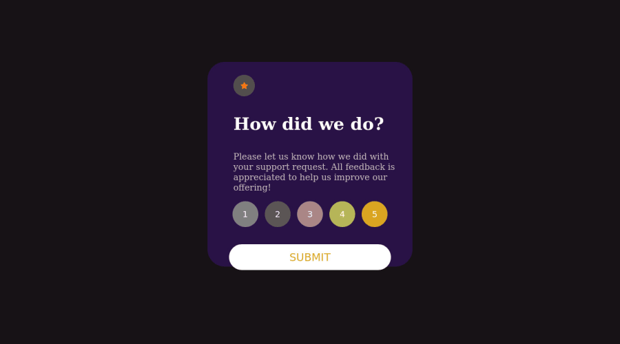
Design comparison
Solution retrospective
Main difficulties are the script part how you connect all the dots is the main idea here.
Community feedback
- @remtainePosted about 2 years ago
Hi saskue7! Great effort on this challenge! Regarding the script, I checked out your JavaScript file and here are some of my comments:
-
Use better variable names and types. For example, your variable "flag" could have a more understandable name like "hasSelectedButton" and would work better as a boolean (ie. true, false) rather than an integer (ie. 1, 0).
-
Also, instead of having a boolean for that, a better solution would be if you just had a variable store the current active button and check if it has one when clicking another rating button or the Submit button. That way:
a. For the first time selecting a rating, change active button and toggle the "showbutton" class on it
b. If changing the rating, toggle class of current active button, change value of active button, then toggle that as well
c. If deselecting the current active rating, toggle class of current active button, change value of active button to null
d. When clicking submit, you can check if active button isn't null. If so, nothing happens. If it does have a value, get the value of the active rating button and output it.
Regarding the design: maybe you changed the font and color on purpose, but for future challenges I suggest you follow what's listed in the style guide. That way, it'll be easier to comment on differences.
Overall it's a nice effort, and I'm sure you'll do even better in future challenges!
Marked as helpful0@saskue7Posted about 2 years ago@remtaine thanks for your great feedback and I'll ensure that next time it will be much smoother.
0 -
Please log in to post a comment
Log in with GitHubJoin our Discord community
Join thousands of Frontend Mentor community members taking the challenges, sharing resources, helping each other, and chatting about all things front-end!
Join our Discord
