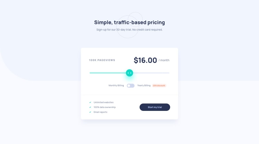
Design comparison
SolutionDesign
Solution retrospective
after a number of times of using mobile-first, I returned to desktop first as I feel thinking in the layout first is better than build the mobile and then think in the layout of the site I tried as I can stop using margins. I made a Custom range input if there is a better solution please mention me
any feedback is appreciated!
Community feedback
Please log in to post a comment
Log in with GitHubJoin our Discord community
Join thousands of Frontend Mentor community members taking the challenges, sharing resources, helping each other, and chatting about all things front-end!
Join our Discord
