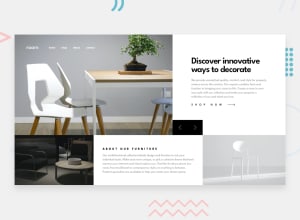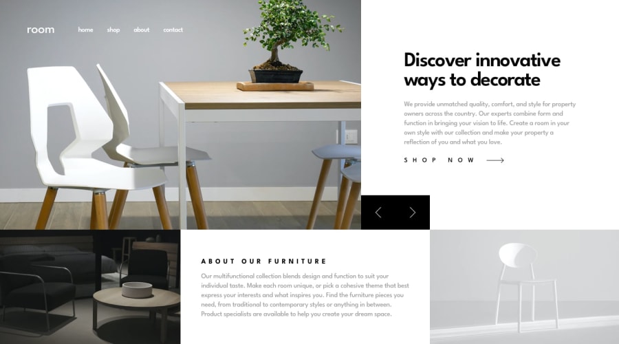
Design comparison
Solution retrospective
This was a pretty fun challenge. I'd like to know anyone's thoughts or feedback. Much appreciated!
Community feedback
- @pikapikamartPosted about 3 years ago
Hey, great work on this one. The layout in desktop is really good, the mobile is good but like others said, the resizing state, layout is not really holding the whole content like it should do, leaving empty spaces on the left and right side.
Additions only to what others have said, suggestions:
- On this one structure, I would have a
headerthat will take the navbar. It would be like:
<header />
<main />
But you might think, " how would you use header since the navbar links holder is like binded to the carousel image container"
position: absolute:>. Making theheaderabsolute to position up top, that way, the image behind it won't be able to affect theheadereven if the image changes since it is a carousel.- The website logo should use its name as the
altvalue likealt="room". Avoid using or adding words that relates to "graphic" such as "icon, image, picture, logo" on thealtattribute. Assistive tech will handle those for you. - Also the flashing of images, not really a fan :> (can cause some effects on the eye).
- Avoid using multiple
h1on a webpage. Use only at least 1h1. The carousel title could use anh2. But you would need anh1on a page, well, theh1would be asr-onlyelement, it would be like:
<h1 class="sr-only">frontendmentor furniture collections</h1>We will just make the
h1only visible for screen reader users.- Adding a visual indicator on the carousel
buttonwould be really good. Right now, if you tab on them, you don't have any indicator where you are at, adding those will be really good. - The
shop now ->you don't have to separate those two, the arrow-icon could be a:afterselector of thatatag. That way, there will be only 1 link like it should be. - Also, making an accessible carousel is hard but it can be done, I don't have any resource by now, but just letting me remind you about carousel accessibility, in case you are going to develop more in the future.
MOBILE
- The hamburger menu toggler needs to have a visual indicator as well. Adding some on the
:focus-visiblewill be really great. - The hamburger menu as well should have a
aria-expandedattribute on it. This will allow a user to be informed that it has expanded something, which is the navbar dropdown. Add as well aaria-labelon thebuttonlike:
<button aria-expanded="false" aria-label="hamburger dropdown toggle" /> # expanded false at default- Closing
buttonon the dropdown as well should have visual indicator along with the thearia-label="close hamburger dropdown"and making thearia-expandedto false. You might be confused on this one, that is why you should add 2 aria-expanded to both button, but same value for each. - You should also used
alt=""on theimgfor the hamburger menu and closing dropdown since you don't want the user to navigate directly with that image. - There is a horizontal scrollbar on the mobile state, what causes this is the
.hamburger-menuselector, since you are addingleft: 15pxit pushes it and making it overflow in the layout. You could applywidth: calc(100% - 15px);on that selector, or maybe addoverflow: hiddento something to hide it.
Aside from those, really great job on this.
Marked as helpful1@Carlos-A-PPosted about 3 years ago@pikamart I really appreciate your feedback and suggestions, you actually helped resolve some issues I was having and wasn't sure how to fix them. Thanks again!
0 - On this one structure, I would have a
- Account deleted
Hi,
At first glance I think it looks ok, and does what it's supposed to be doing.
-
This isn't an easy project to make responsive, which is why I think you resorted to an early switch to mobile view at 1260px.(which I think is a bad idea)
-
Which leaves a huge amount of unused space on the sides, and I don't think that is a good thing.
Keep Coding👍
Marked as helpful1@Carlos-A-PPosted about 3 years ago@thulanigamtee, thanks for the feedback. .. That was my next task, as I was mostly glad that I was just able to make it work, aha.
0 -
- @zaraag92Posted about 3 years ago
Congrats on finishing this project.
It looks nice, but as for me you can add fade animation to only images, so the menu will be fixed and animation will affect only images.
And I'll do more responsive. By the way you can check mine too. I just finished it.
2
Please log in to post a comment
Log in with GitHubJoin our Discord community
Join thousands of Frontend Mentor community members taking the challenges, sharing resources, helping each other, and chatting about all things front-end!
Join our Discord
