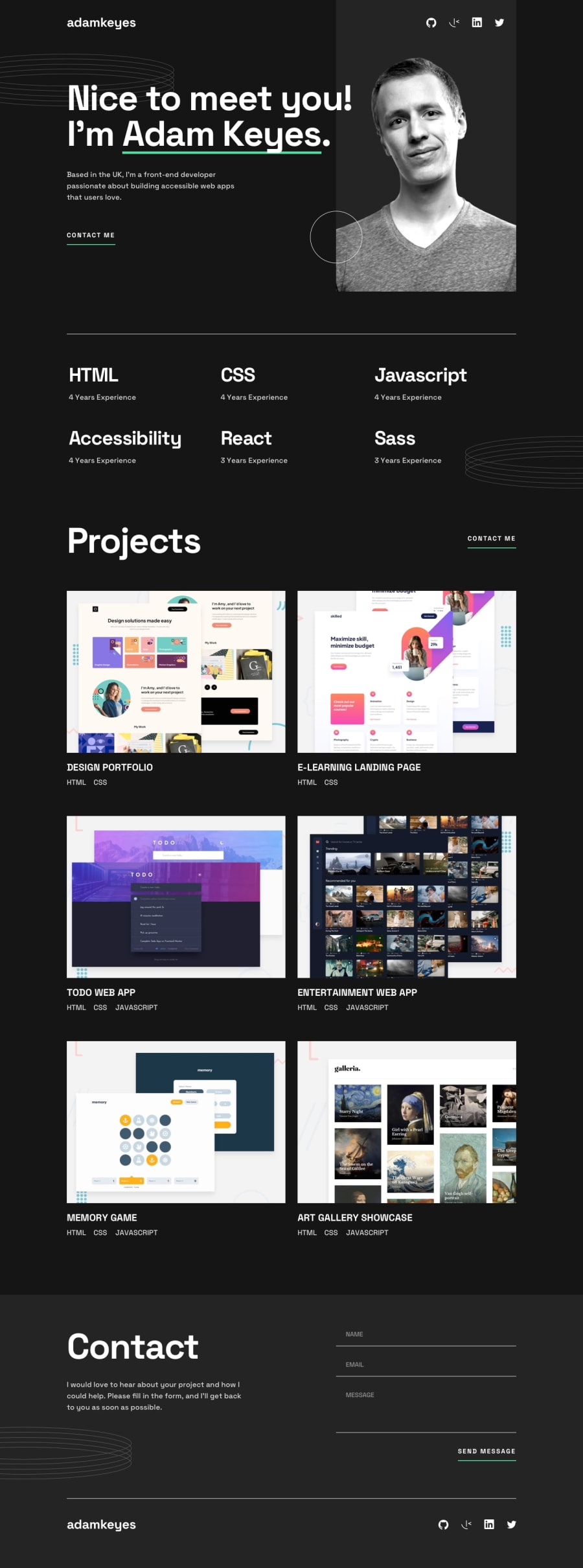
Design comparison
SolutionDesign
Solution retrospective
What I found difficult was allignment of the divs for the header I made. I also found that producing that javascript for the hovering over the projects a bit challenging. I was able to make it work but I feel it can be better. Instead of hearts or anything I would like to know if I could get some professional feedback as this one is a junior developer project and I would like to know how I did and if I could do anything better. Thank you for any feedback that is given. I would like to improve this site if I can. Thank you
Community feedback
Please log in to post a comment
Log in with GitHubJoin our Discord community
Join thousands of Frontend Mentor community members taking the challenges, sharing resources, helping each other, and chatting about all things front-end!
Join our Discord

