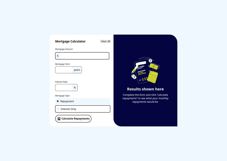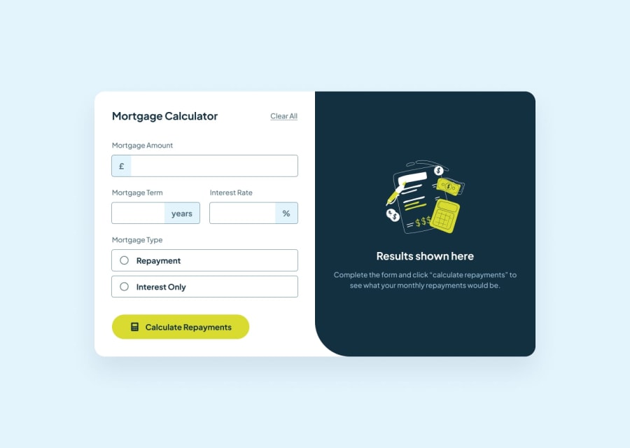
Design comparison
SolutionDesign
Solution retrospective
What are you most proud of, and what would you do differently next time?
I am most proud of the calculations and interactivity
What challenges did you encounter, and how did you overcome them?I didn't know which colors to use. I think it would be really helpful if the colors can be provided in future projects
What specific areas of your project would you like help with?No areas except for the colors
Community feedback
- @MarkPraisePosted 6 months ago
Always make sure to read the style.md file there you will see the the colors.
I have some comment,:
- Your clear button isn't taking away the invalid styles away
- there is a little bit of overflow on the x when the page load the page loads in the x direction
- when an input is focused the color is not well filled towards the label part.
- the repayment div itself should be able to respond to a click on the input radio button and not just the button itself.
In all congratulations for the stride
0
Please log in to post a comment
Log in with GitHubJoin our Discord community
Join thousands of Frontend Mentor community members taking the challenges, sharing resources, helping each other, and chatting about all things front-end!
Join our Discord
