Design comparison
Community feedback
- @Moyo75Posted over 3 years ago
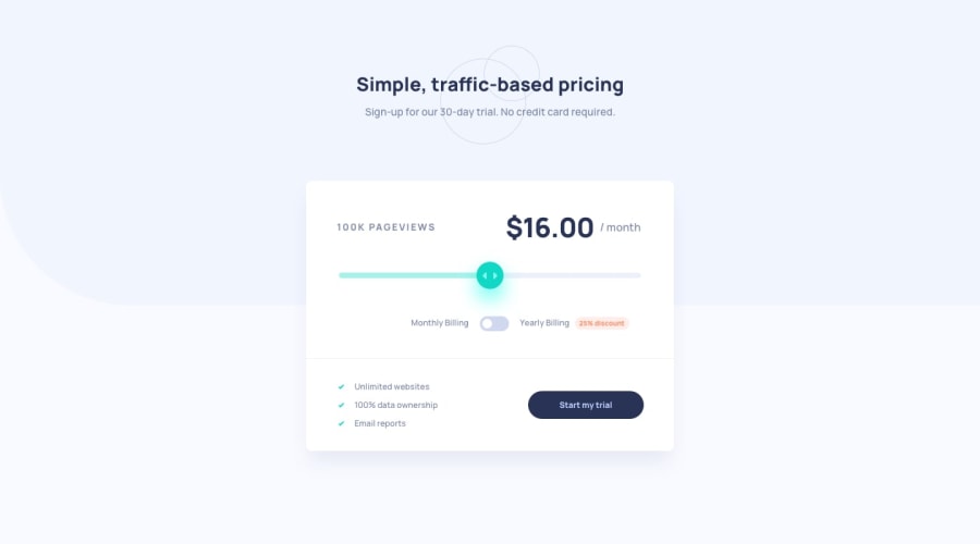
On mobile:
-
The main content of your app (what you put in
asidetags) takes up the total width of the view, unlike in the design. The monthly amount text seems out of place on many mobile screen sizes. -
The toggle button seems shrunken, thus the toggle slides out of place and the background color states aren't changing. Also the text flanking the button should be on one line and
discountshouldn't be visible on mobile.
General:
-
The circles in the header background are somewhat truncated. The pageviews text lacks spacing. The slider's background colors are missing and don't flow too on change.
-
On toggling the button, the pricing multiplies increasingly out of logic. I believe this is the line in your JS behind that:
price.textContent = ${(priceInt -(priceInt * .25)) *12};And the pink box surrounding the discount text is more curved at the sides. -
The shadow surrounding the component seems a little darker and you missed the reference to yourself as the developer and also to FEM.
I hope these help you in making your project look and behave more as illustrated in the designs and style guides. Let me know what you think!
Marked as helpful1 -
Please log in to post a comment
Log in with GitHubJoin our Discord community
Join thousands of Frontend Mentor community members taking the challenges, sharing resources, helping each other, and chatting about all things front-end!
Join our Discord
