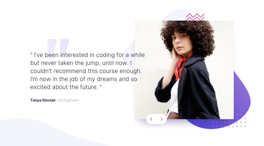
Design comparison
Solution retrospective
I started from mobile layout with flex box. When I moved to desktop version I used absolute-relative positioning to place the elements; I'm not sure I did it in the best way possible; can someone give me some advice?
I added some animations, but I've some issue if someone hammer the buttons. How may I handle buttons hammering?
Community feedback
- @En-JenPosted about 4 years ago
Hey Giovanni, really nice job with this challenge! I really like the animations and the hover state on the buttons and it looks really close to the design :) I just have a few suggestions for you:
-
I would try to stray away from using id's as your CSS selectors and instead try to always use classes. You can read more about the rationale for that in this article (https://paulcpederson.com/articles/css-for-people-who-hate-css/)
-
It would be nice to see some change in the size of the elements/layout for tablet widths. At just under 1200px screen width, it looks like there is too much whitespace.
-
You might consider adding a max-width to the container because at large desktop screen widths, the text and the image get really far apart.
-Jen
1@GiovanniRanzatoPosted about 4 years ago@En-Jen Hello Jen thanks for your advice! I will improve the design for sure.
0 -
- @DarkFMPosted about 4 years ago
Hi Giovanni.
Good job with the solution. I really like the animations as it is a nice touch. To answer your question on how to handle when the buttons are clicked really fast, you can implement something called
debouncing. It is basically adding a delay after each button click and during this time you disable user input.You can take a look at this example for more details
0@GiovanniRanzatoPosted about 4 years ago@DarkFM thanks your advice will be quite useful!
0
Please log in to post a comment
Log in with GitHubJoin our Discord community
Join thousands of Frontend Mentor community members taking the challenges, sharing resources, helping each other, and chatting about all things front-end!
Join our Discord
