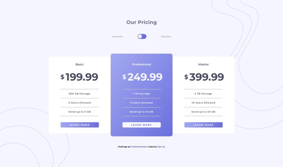
Design comparison
SolutionDesign
Solution retrospective
Hi Frontend Mentor Community,
I had fun building this project. It's my first time building a toggle button, so I'm not sure I did it correctly. I made it using an input tag, but as I was styling it I realized I could've gotten the same results using regular divs.
I would be grateful if someone took a look at my code and gave me feedback on how to improve the toggle button in terms of accessibility and functionality. Any other feedback is also appreciated.
Thank you :)
Community feedback
Please log in to post a comment
Log in with GitHubJoin our Discord community
Join thousands of Frontend Mentor community members taking the challenges, sharing resources, helping each other, and chatting about all things front-end!
Join our Discord
