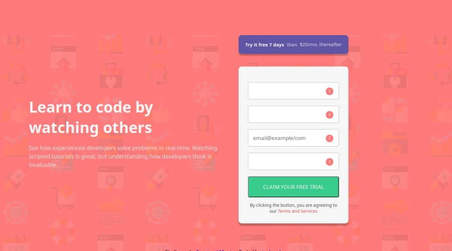

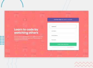
Design comparison

Solution retrospective
I'll trying expanding on the user's info and collecting more data on the users by adding Phone number, marital status, country and so on
What challenges did you encounter, and how did you overcome them?It's was a little bit hard in the changing of placeholder to an icon on the desktop responsiveness but did a little research and with the help of some videos, i was able to overcome it.
What specific areas of your project would you like help with?None
Community feedback
- @grace-snowPosted 3 months ago
Why have you tagged this with all those tags that are not relevant to your solution?
There are quite a lot of problems in the html here. This is an ideal challenge to learn how to code an accessible form but so far you're missing that opportunity.
- all content should be contained within landmarks. A
Everything in this design belongs in a
mainlandmark. There is nothing appropriate for a header in this design. - the background images either need to be on the background, or they need to be in the html picture element and have empty alt. The empty alt is important if they are in the html as these are decorative images only and not meant to be announced by screen readers.
- form inputs must always have labels
- form inputs that collect personal data must have appropriately filled autocomplete attributes.
- error containers must not be display none. They need a unique ID each and an aria-live attribute. Then the inputs need aria-desciribedby referencing the ID of their error container. You then fill the errors dynamically with JS. This is how you serve errors in an accessible way, ensuring they are correctly announced by screen readers and programmatically linked to their inputs.
- if you're going to have a success message like that you need to ensure it is announced by screen readers and that it is visible to all. You can do that by wrapping it in an aria-live container, giving it a role of "alert" or by moving focus to it. It should scroll into view just in case people are viewing on a small or zoomed/magnified screen.
- font size must never be in px. Use rem. https://fedmentor.dev/posts/font-size-px/
- get into the habit of including a full modern css reset at the start of the styles in every project you do. Look up Andy Bell's modern css reset.
- you shouldn’t need any absolute positioning or widths in this challenge. The layout needs a max width in mobile and on larger screens that's all, with either flex or grid for the page layout.
- you should be styling mobile first. And I recommend media queries in rem or em not px so that the layout scales correctly for all users including those who have a different text size setting in their browser or device. You style mobile as the default then add a min width media query only to make changes for larger screens.
I think you will need to make changes to all your existing solutions after fixing this one.
Marked as helpful0@teshcodesPosted 3 months ago@grace-snow Thanks, I'll do the needful.
. I'll need your review when am finally done with the changes you told me amend.
0 - all content should be contained within landmarks. A
Everything in this design belongs in a

Please log in to post a comment
Log in with GitHub
Join our Discord community
Join thousands of Frontend Mentor community members taking the challenges, sharing resources, helping each other, and chatting about all things front-end!
Join our Discord