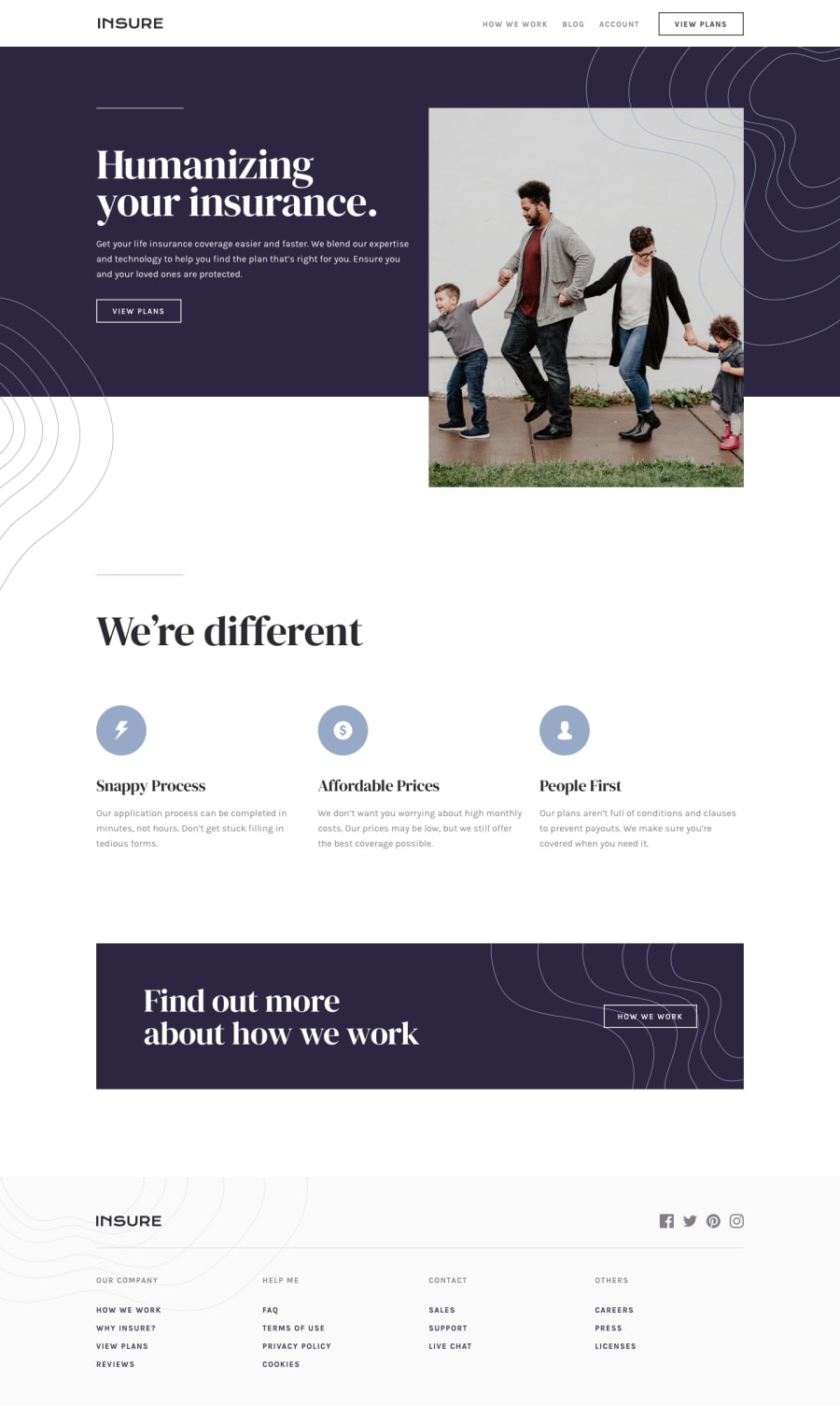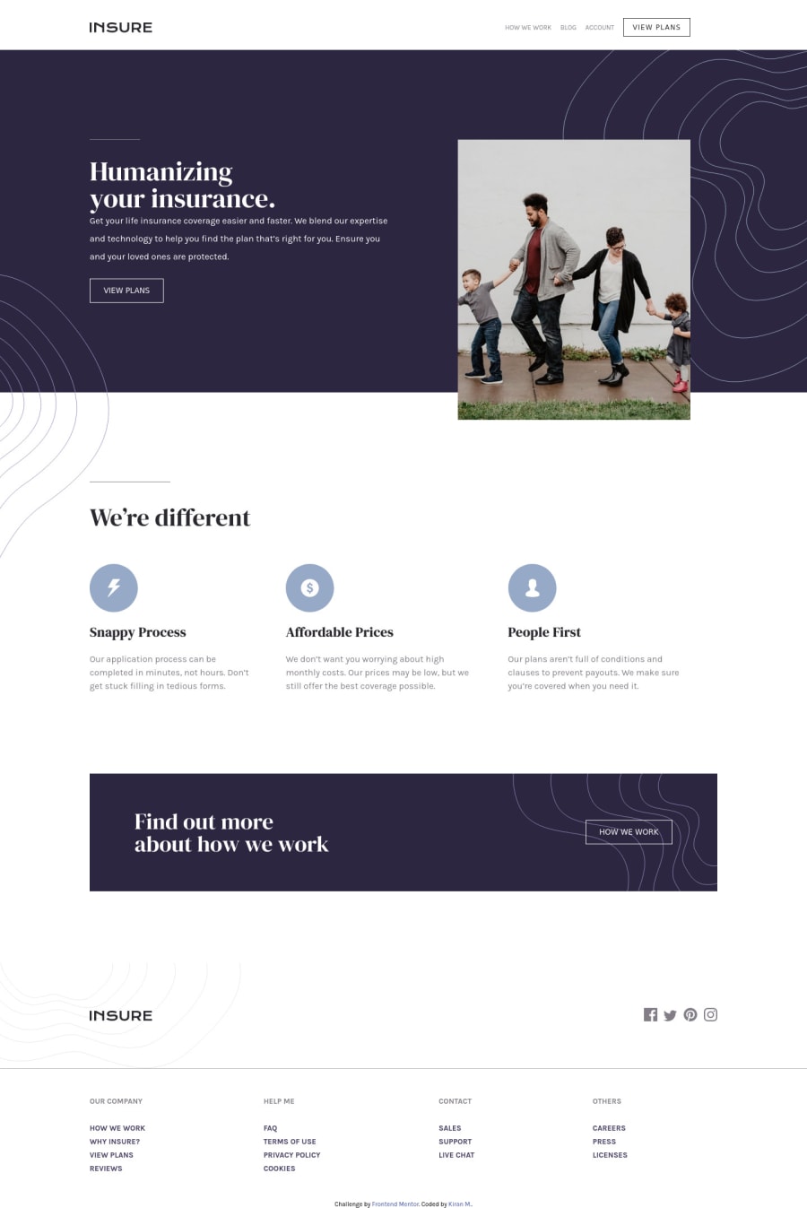
Design comparison
Solution retrospective
Hey everyone, just completed the Insure Landing page. This really tested my CSS skills and learnt some new tricks along the way. Any feedback comments will be highly appreciated.
Many thanks, Kiran
Community feedback
- @plainsight16Posted about 3 years ago
great work kiran, just a small issue on the viewports, as the screen reduces, the view port jumps straight to the smallest screen. In other words it doesn't accommodate all screens.
Marked as helpful1@K-MannnnPosted about 3 years ago@plainsight16 Thanks for the feedback. You're right, I should make the designs more compatible for various screen sizes, something I'll keep in mind for my next projects. Happy coding!
0 - @muhammadshajjarPosted about 3 years ago
Hi! congrats on completing the challenge, layout on the desktop looks great but it breaks on around 938px by intro image overlaps the intro text
- Instead of using divs for structuring pages you should need to add some semantic markers to designate sections of the page as the header, navigation, main, and footer because using divs are played out.
<header> </header> <main> <section></section> </main> <footer> </footer>
For more info you can refer to this
- Add
box-sizing: border-box
, it is great practice and saves you from unexpected outputs Css tricks leads you to best practice of using it - Logo image should be wrap in an anchor tag because the logo is used to navigate to the home page so it should be a link
- The how we work and view plans should be a link, In my opinion, use
a
tag and not abutton
. Use thebutton
if it will act as a control for something. But on this, it is treated as a link, go fora
tag. - Navigation list should need to be in
nav
- For class naming I recommend you to try BEM naming convention it is best practice to name classes
- Don't forget to take look at the report, it helps a lot to overcome accessibility issues
Apart form this, great work :)
Marked as helpful0@K-MannnnPosted about 3 years ago@muhammadshajjar Thankyou Muhammad for the detailed feedback. I was struggling with all those things that you mentioned. It'll definitely help me in my upcoming projects.
Thanks again! :)
0
Please log in to post a comment
Log in with GitHubJoin our Discord community
Join thousands of Frontend Mentor community members taking the challenges, sharing resources, helping each other, and chatting about all things front-end!
Join our Discord