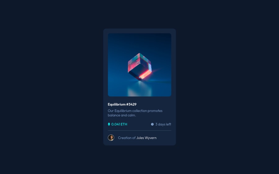


Design comparison

Solution retrospective
This one was the easiest one so far. I think I am getting better in this =) The hardest part was, again, centering and positioning the images and elements. The image overlay in the hovering effect was also tricky.
Community feedback
- @elaineleungPosted over 2 years ago
Hi Bernardo, great work in making this responsive, and I think you did well on the whole! Two quick comments for you:
-
You can add a bit of margin around the component so that when it is resized in smaller screen sizes, there's some spacing around it and its sides won't be touching the browser.
-
About
picture, since you only have one image here and not a desktop and mobile version of the image, you don't really need to usepicture. Thepictureelement is meant to be used as a way to handle changing different versions of the same image, whether size or format. Since there's only one version here, you can simply use adivif you need to make it into a container for the image. Read more aboutpicturehere: https://developer.mozilla.org/en-US/docs/Web/HTML/Element/picture
That's all, great work once again, and yes, you're getting better at this, keep going! 😊
Marked as helpful1@BernardoHollmannPosted over 2 years ago@elaineleung Hi Elaine! Thanks for your comment! Yes, I always forget to add margin/padding in an element. Thanks for pointing it out and I will try to remember implementing it in the future. I read the article you sent me and now I know that <picture> is more offten used when resizing the window screen. I am still trying to use different approaches to some problems that I am having (specially with positioning and sizing pictures inside a container) and, in this case, I tried the <picture> tag. It worked, but, as you said, it is probably better to use a <div> to make it simpler. Thanks so much for your comments! I really need to improve and these tips are exactly what I need. By the way, this helps me to keep on going! =)
0 -
- @denieldenPosted over 2 years ago
Hi Bernardo, congratulations on completing the challenge, great job! 😁
Some little tips for optimizing your code:
- you can use
articletag instead of a simpledivto the container card for improve the Accessibility - remove all unnecessary code, the less you write the better as well as being clearer: for example the
picturetag container of image - another approce is creating a
divthat appears on hover. I used tailwind but you can still see and understand which css properties you can use to do the same. Look here -> my solution - Using
<hr>for the line is not the best way because this tag have a semantic meaning... in this case use div withborder-bottombecause this line is decorative - add
transitionon the element with hover effect - instead of using
pxuse relative units of measurement likerem-> read here
Hope this help! Happy coding 😉
Marked as helpful1@BernardoHollmannPosted over 2 years ago@denielden Hi Daniel! Thanks for your comment!
I see your code and I am very impressed! Hope someday I can get as good as you!
I've never used frameworks before, despite Bootstrap and I can see that tailwind it is a very interesting alternative. I will keep on coding with pure CSS, but I will definetly try tailwind in the future. It seems very productive when mastered.
Thanks again for your comment and for the tips!
1@denieldenPosted over 2 years ago@BernardoHollmann You are welcome and keep it up :)
0 - you can use
- @correlucasPosted over 2 years ago
👾Oi Bernardo , tudo bem? Parabéns pelo desafio!
Aqui algumas dicas pra melhorar sua solução:
Quando esse NFT card vai ficando mto pequeno o texto começa a ficar muito colado, um jeito de melhorar isso é fazer com que a parte dos preços/creator fiquem em linhas diferentes depois de uma determinada largura, por exemplo essa media query que apliquei pro seu código:
@media (max-width: 340px) {
.complement {
    max-width: 100%;
    display: flex;
    justify-content: space-between;
    margin-bottom: 20px;
    flex-direction: column;
}

.info-user {
    font-weight: 300;
    color: hsl(215, 51%, 70%);
    display: flex;
    align-items: center;
    flex-direction: column;
}
}
👋 Espero que essas dicas tenham sido úteis e continue codando!
0


Please log in to post a comment
Log in with GitHub
Join our Discord community
Join thousands of Frontend Mentor community members taking the challenges, sharing resources, helping each other, and chatting about all things front-end!
Join our Discord