Design comparison
SolutionDesign
Solution retrospective
Open to any suggestions. Thank you! :)
Community feedback
- @JoyGHubPosted over 2 years ago
Hi Kate!
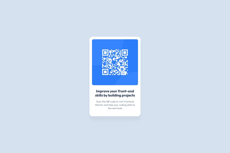
The second paragraph's weight is too small so the text is hard to read, and the box-shadow you placed on the card is a little too strong. I would personally make it blurrier and drop its opacity a bit.
Also, the background color seems to be a little different.
Other than that, it looks great. Keep it up!
- Stefan RIZEA
Marked as helpful0
Please log in to post a comment
Log in with GitHubJoin our Discord community
Join thousands of Frontend Mentor community members taking the challenges, sharing resources, helping each other, and chatting about all things front-end!
Join our Discord
