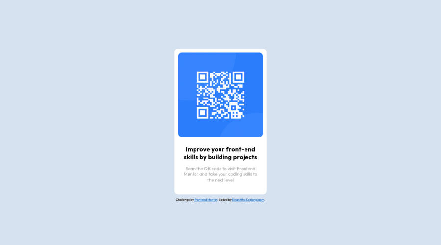
Design comparison
Solution retrospective
any feedback is appreciated!
Community feedback
- @grace-snowPosted over 1 year ago
Hi
This looks good overall but there are some important changes needed that you can learn from
- As others have said, container should be a
mainand attribution should be afooterelement - Do not style on IDS. That's not what they're for. I've written a blog post all about IDs that may help your understanding there
- The image is the most important content on the page. It needs to have a properly written alt description
- You don't need the details div on this. It's not a problem having it. But we should always keep html as simple as it can be
- You need to update your personal attribution link - point it to your frontend mentor profile or github profile
- It is better for performance to link fonts in the head instead of importing in css
- It's a good idea to always include a modern css reset at the start of your styles. Andy Bell and Josh Comeau both have good examples you can use if you look them up
- It's essential to never ever write font size in px. Use rem so users font size preferences in their browser or operating system can be respected
0@kkkrajPosted over 1 year ago@grace-snow thank you so much for your feedback!
0 - As others have said, container should be a
- @0xabdulkhaliqPosted over 1 year ago
Hello there 👋. Congratulations on successfully completing the challenge! 🎉
- I have other recommendations regarding your code that I believe will be of great interest to you.
HTML 🏷️:
- This solution generates accessibility error reports due to
non-semanticmarkup, which lack landmark for a webpage
- So fix it by replacing the
<div id="container">element with the semantic element<main>along with<div class="attribution">into a<footer>in yourindex.htmlfile to improve accessibility and organization of your page.
- What is meant by landmark ?, They used to define major sections of your page instead of relying on generic elements like
<div>or<span>
- They convey the structure of your page. For example, the
<main>element should include all content directly related to the page's main idea, so there should only be one per page
CSS 🎨:
- let me explain, How you can easily center the component.
- We don't need to use
marginandpaddingto center the component both horizontally & vertically. Because usingmarginorpaddingwill not dynamical centers our component at all states
- To properly center the component in the page, you should use
FlexboxorGridlayout. You can read more about centering in CSS here 📚.
- For this demonstration we use css
Gridto center the component
body { min-height: 100vh; display: grid; place-items: center; margin: 0; }- Now remove these styles, after removing you can able to see the changes
#container {
    margin: 0 auto;
    margin-top: 20vh
}
I hope you find this helpful 😄 Above all, the solution you submitted is great !
Happy coding!
0@maia-fwPosted over 1 year ago@0xAbdulKhalid This is such good feedback! :) Would you be able to look at mine as well? Im a complete beginner and I am about to post my solution.
0@0xabdulkhaliqPosted over 1 year ago@maia-fw Yeah sure, and I'm glad to welcome you to the Frontend Mentor Community !
1@kkkrajPosted over 1 year ago@0xAbdulKhalid thank you so much for your feedback!
0 - @anishamurthyPosted over 1 year ago
Your solution looks good! Make sure you include a main tag either as the card or wrap it around the card. Also, you should use em for font size to make it scalable for smaller screens.
0@kkkrajPosted over 1 year ago@anishamurthy thank you so much for your feedback!
0 - @HassiaiPosted over 1 year ago
Replace<div id="container">with the main tag and <div class="attribution"> with the footer tag to fix the accessibility issues. click here for more on web-accessibility and semantic html
To center #container on the page using flexbox or grid instead of margin, add min-height:100vh; display: flex; align-items: center: justify-content: center; or min-height:100vh; display: grid place-items: center to the body.
USING FLEXBOX:
body{
min-height: 100vh;
display: flex;
align-items: center;
justify-content: center;
}
USING GRID: body{ min-height: 100vh; display: grid; place-items: center; }Use relative units like rem or em as unit for the padding, margin, width values and preferably rem for the font-size values, instead of using px which is an absolute unit. For more on CSS units Click here
For a responsive image replace the width in the img with
max-width.Increase the padding value of .card to 16px
Hope am helpful.
Well done for completing this challenge. HAPPY CODING
0 - @visualdennissPosted over 1 year ago
Hey there Khanitta,
Great work! Your submission looks really nice overall. Even though, this seem to match the solution screenshot very closely, using margin: 20vh is not the best practice to align the item to center or position it. Because you lose control as the browser sizes change and when the app gets complicated, your layout might break unintentionally. Instead you can use the approach of setting body to min-height: 100vh, so it cover the entire screen, and then use that as a Flexbox Container or a CSS Grid Container to center. This way, your element will stay consistently in the center.
e.g. body { background-color: hsl(212, 45%, 89%); font-family: 'Outfit', sans-serif; display: grid; min-height: 100vh; place-items: center; }
Hope you find this feedback helpful!
0@kkkrajPosted over 1 year ago@visualdenniss thank you so much for your feedback!
0
Please log in to post a comment
Log in with GitHubJoin our Discord community
Join thousands of Frontend Mentor community members taking the challenges, sharing resources, helping each other, and chatting about all things front-end!
Join our Discord
