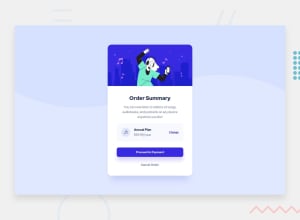
Design comparison
Solution retrospective
I just finished my first challenge at Frontend Mentor. Any feedback and suggestions on how I can improve are very welcome!
Community feedback
- @grace-snowPosted about 3 years ago
Hi this looks good but the html semantics needs a bit of work.
I recommend making the card a main element - that will fix your accessibility issues in the report.
Also remove the header, that should just be an img element, or a div if you really need the wrapper element.
The price should be in a paragraph. Never have text in a div or span alone.
What are you expecting “Change” to do? I would expect it to toggle the price to monthly, but are you expecting it to navigate users to a different page? Curious there.
Never have font size in px. Always REM or occasionally em.
And I recommend using max-width instead of width on the card. If you do that there should be no need for a media query on this challenge. (Font sizes shouldn’t need to change, just keep them the same on all)
Marked as helpful1@Mahmoud-Elshaer-10Posted about 3 years ago@grace-snow Thank you so much for your feedback, it really helped me. I have just amended the changes you recommended, I would appreciate it if you have a second look and let me know.
0@grace-snowPosted about 3 years ago@Mahmoud-Elshaer-10 looks good except the card is Hitting the edges of my screen on mobile. Make sure there is some padding on the outer wrapper to prevent that, or some small margin on the card itself
0
Please log in to post a comment
Log in with GitHubJoin our Discord community
Join thousands of Frontend Mentor community members taking the challenges, sharing resources, helping each other, and chatting about all things front-end!
Join our Discord
