Design comparison
Solution retrospective
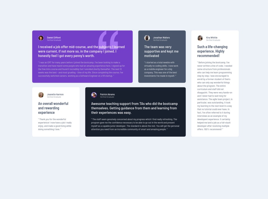
Please let me know if you see any areas of improvement within the code. I messed up by using grid-auto-fill: row so I had to use flexbox to reorder the elements for the mobile version. Will try to fix that some other time.
Thanks!
Community feedback
- @nikolovlazarPosted almost 4 years ago
Great job Zach!
The layout looks pretty much pixel perfect! I can notice that you're missing the card shadows. That would be very easy to fix for you, since you're a Pro user and you have the Figma design file.
On the other hand, the responsiveness is not perfect. There's a point between the Desktop breakpoint and the Mobile breakpoint where the content is bleeding off the edge. This layout is not simple though, it's a complex layout. What you can do is research the Masonry Grid layout and its responsiveness. It'll give you some ideas on how to refactor your solution and make it responsive.
Keep up the great work man! Cheers š
2@zky63Posted almost 4 years ago@lazarnikolov94 Thanks for the reply! I had never heard of the Masonry Grid layout but it does seem really useful. I'll give it a shot and see how it turns out.
1 - @ApplePieGiraffePosted almost 4 years ago
Hey, Zach Kyman! š
Nice work on this challenge! The desktop and mobile layouts of the site look good! š
In addition to lazarnikolov94's helpful feedback, I suggest,
- Perhaps adding
overflow-x: hidden
to thebody
(or something similar) to prevent a horizontal scroll bar from appearing along the bottom of the screen in the desktop layout. š
Keep coding (and happy coding, too)! š
And happy holidays! š
1 - Perhaps adding
Please log in to post a comment
Log in with GitHubJoin our Discord community
Join thousands of Frontend Mentor community members taking the challenges, sharing resources, helping each other, and chatting about all things front-end!
Join our Discord