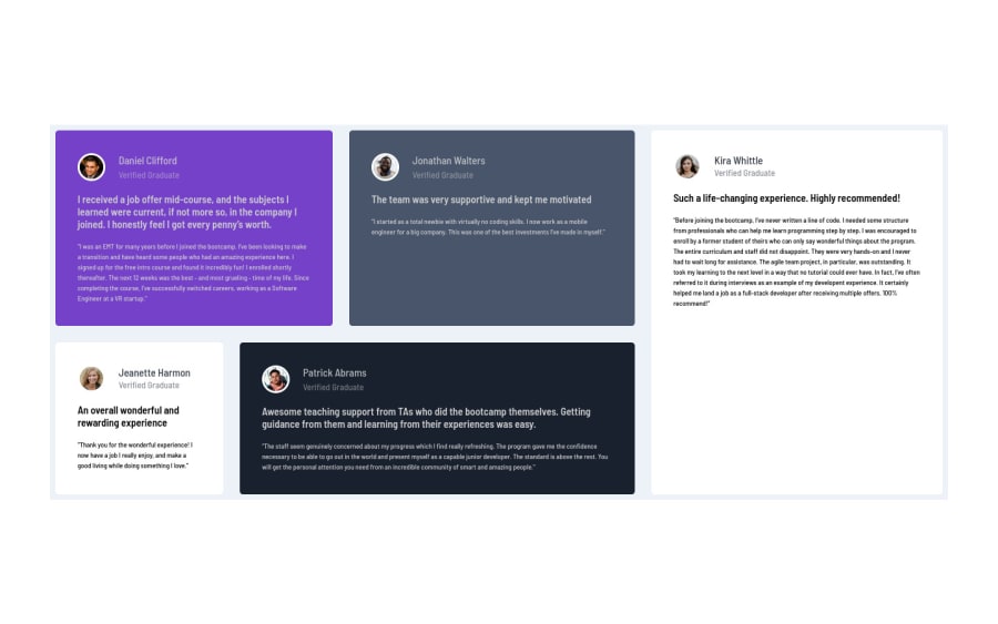
Design comparison
Solution retrospective
Few things I missed. But few months back, I wasn't even able to understand how to create such layouts. At least I understood grids, and able to implement this both for desktop and mobile. Working on this more to make it exact and upload it again here as well as on my github repo. Suggestions always welcome.
Community feedback
- @pikapikamartPosted over 3 years ago
Hey, great work on this one. The layout in desktop is fine as well as the mobile state.
Some suggestions would be that:
-
Font-sizes. Right now, they are too small to read, on the desktop view, you may want to adjust them.
-
It will be really awesome if you somehow manage to copy the grid elements sizes on the original. What makes this necessary is that, if you somehow look at the text inside them, they are perfectly fitted right, so using those sizes will really benefit the layout.
-
Your
body
tag should have thebackground-color
so that the whole layout will be sitting on it. Right now, it is only the container, whose holding the grid have the bg-color.
But still, really good job on this one^
1 -
- @parmeet9891Posted over 3 years ago
Thank you so much for this valuable feedback. I did not realize this stuff. Thanks much, I appreciate.
0
Please log in to post a comment
Log in with GitHubJoin our Discord community
Join thousands of Frontend Mentor community members taking the challenges, sharing resources, helping each other, and chatting about all things front-end!
Join our Discord