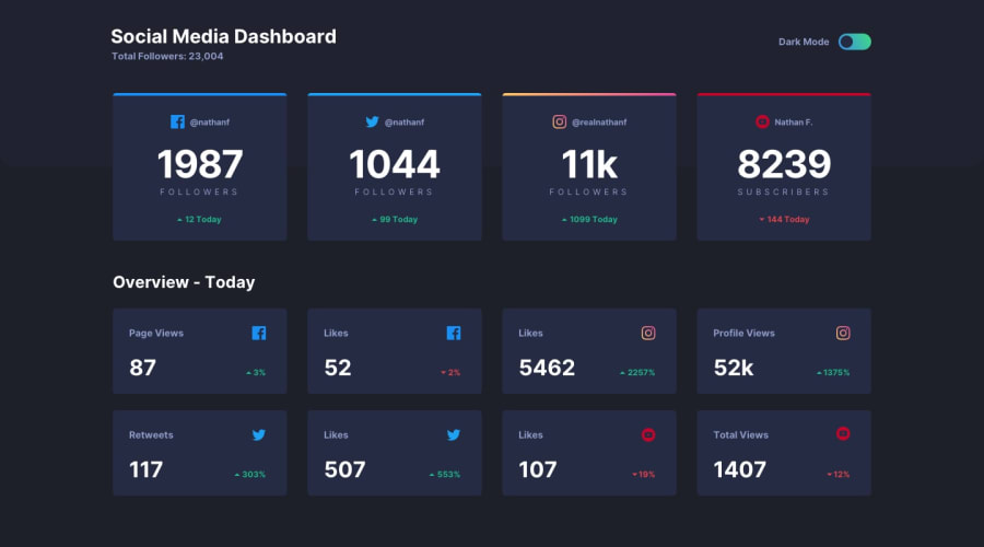
Design comparison
Solution retrospective
Very nice challenge, I used CSS variables to change all the layout without too much trouble, any comment is welcome.
Community feedback
- @Antoine-FloPosted about 4 years ago
Thanks ApplePieGiraffe, your solution to this challenge inspired me 😉
1 - @ApplePieGiraffePosted about 4 years ago
Oh, yes, great work, Antoine! 👍
Your solution looks great and responds very well! 👏
I like the subtle animation you added to the toggle when switching between light/dark themes! 🤩
Keep coding (and happy coding, too)! 😁
1 - @artimysPosted about 4 years ago
Hi Antoine, great job here 👍
That way of overwriting the css variables to switch colors is brilliant. Plus good use of the
:beforepseudo for the instagram gradient and toggle white dot.I would only suggest adding a
:focusto your toggle button when tabbed on it for accessibility.Keep on coding!!
1@Antoine-FloPosted about 4 years agoThanks I will look into that 👍 To be honest overwriting the variables wasn't my idea, but I'm happy with the result and it teaches me a lot.
0
Please log in to post a comment
Log in with GitHubJoin our Discord community
Join thousands of Frontend Mentor community members taking the challenges, sharing resources, helping each other, and chatting about all things front-end!
Join our Discord
