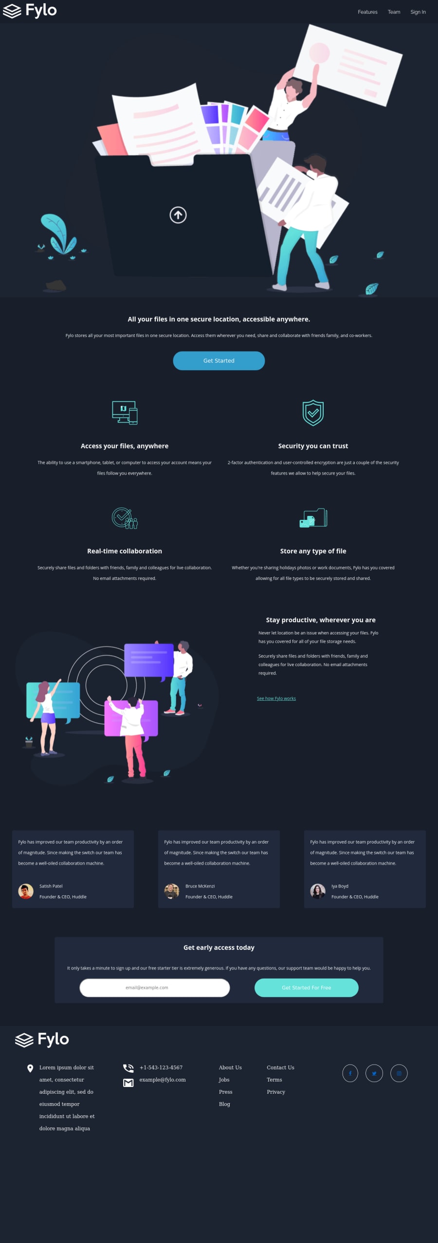
Design comparison
SolutionDesign
Solution retrospective
I ended up not adding up the main background(curve lines) because I don't know how to place it yet so if there's anything you guys can point out, It'd be much appreciated. Still working on the JS part. Will updated this file as soon as possible
Community feedback
Please log in to post a comment
Log in with GitHubJoin our Discord community
Join thousands of Frontend Mentor community members taking the challenges, sharing resources, helping each other, and chatting about all things front-end!
Join our Discord
