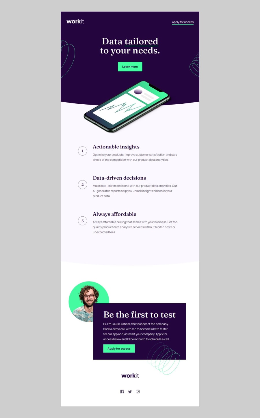
Design comparison
SolutionDesign
Solution retrospective
What are you most proud of, and what would you do differently next time?
I am proud to have made my first design template for frontend mentor, and made use of grid and flex to organize certain elements, next time I would do it using some methodology like bem or itcss
What challenges did you encounter, and how did you overcome them?Organize some elements and how to rearrange them as the screen size changes
What specific areas of your project would you like help with?Tips to refactor the code and polish it better
Community feedback
Please log in to post a comment
Log in with GitHubJoin our Discord community
Join thousands of Frontend Mentor community members taking the challenges, sharing resources, helping each other, and chatting about all things front-end!
Join our Discord
