Design comparison
SolutionDesign
Solution retrospective
Any suggestion will be appreciated
Community feedback
- @mattstuddertPosted almost 5 years ago
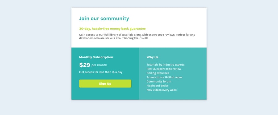
Hey Shahmir, nice work on this challenge! I've only got a couple of small recommendations:
- I'd recommend using a
ulinstead of apwithbrtags. This is because the content is a list of features/benefits, so aulmakes sense. - On a future project, I'd recommend having a go at using
min-widthmedia queries instead ofmax-width. It often leads to less code and also has the benefit of loading in fewer styles for mobile users.
Keep up the great work!
0@shahmirfaisalPosted almost 5 years ago@mattstuddert Thanks for your suggestions I just realized that, I forgot ul tag and using a p tag at that point doesn't makes any sense. Thanks ;)
0 - I'd recommend using a
Please log in to post a comment
Log in with GitHubJoin our Discord community
Join thousands of Frontend Mentor community members taking the challenges, sharing resources, helping each other, and chatting about all things front-end!
Join our Discord
