Design comparison
Solution retrospective
Any feedback will be appreciated
Community feedback
- @grace-snowPosted almost 4 years ago
Hi Jose,
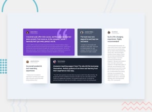
Your solution looks a fair bit darker than the design in its background. And the images are being distorted a little, but you could fix that by giving them a width and height so they stay circular. Other than that all looks very close, we'll done 👍
In html, I wouldn't have part of the quotes as heading elements. Remember it's not about size what gets to be a heading, but about document structure. If you read those as headings on a contents page (which is what assistive tech users see) , that wouldn't make sense. If anything was a heading, I'd make it the people's names.
Hope thats helpful ☺
0
Please log in to post a comment
Log in with GitHubJoin our Discord community
Join thousands of Frontend Mentor community members taking the challenges, sharing resources, helping each other, and chatting about all things front-end!
Join our Discord
