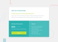
Design comparison
Solution retrospective
Hello there! It was an interesting and easy project.
But I faced some problems with background colors of subscription and about section. There were no clear instructions given about it. I got confused and wasted my time to exactly match the background-color. Hehe, still unable to do it. Do feedback if you know the answer.
Overall , it was good. Cheers Coding!!
Community feedback
- @MarcusTuliusCiceronPosted over 2 years ago
Hello Priya, congrats for completing this challenge.
For information color are always given in the file called style-guide, however if it is not there what you can do is open the design files in an image editor and use eye drop tool to get the RGBA code of each color, this will avoid you to loose time with something that should be given to you.
Hope this will help you for future challenge :)
Happy coding
Marked as helpful1@Priya366Posted over 2 years ago@MarcusTuliusCiceron Hello ! Your this feedback is really helpful. Thanks for this useful idea.
0 - @shashreesamuelPosted over 2 years ago
Hey good job completing this challenge
Keep up the good work
Your solution looks great however I think the following should be considered
-
the card is a bit too wide
-
the background color of the body element should match the color specified in the
style-guide.mdfile -
the top half of the grid is supposed to be on white
-
the card is supposed to have a subtle box-shadow using the
box-shadowproperty
I hope this helps
Cheers Happy coding 👍
1 -
Please log in to post a comment
Log in with GitHubJoin our Discord community
Join thousands of Frontend Mentor community members taking the challenges, sharing resources, helping each other, and chatting about all things front-end!
Join our Discord

