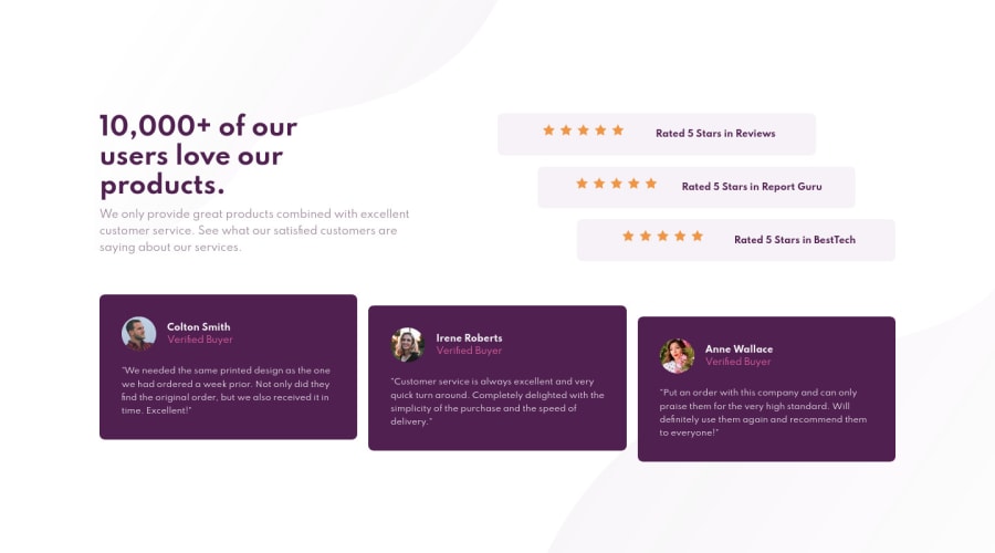
Design comparison
Solution retrospective
1)I have some doubts with flexbox, when it is in flex-direction:row, that is to say by default, I try to make the elements take the same height and it doesn't work, when I put flex:1 or any other value to the elements, they remain the same.
2)some improvement with respect to the design
Community feedback
- @vanzasetiaPosted about 3 years ago
👋 Hi Martha!
👍Good job on completing this challenge! This solution looks good on both mobile landscape and portrait mode and so on desktop view too! 👏
Also, you have done a great job on accessibility part where for decorative images (star icons) you add
aria-hiddenand leave thealtempty. Well done!👍I have some feedbacks on this solution:
- Wrap the
blockquotecontent withptag.blockquoteelement’s content is a quote, not a chunks of characters. Source: HTML best practice github repo - You can import the
Spartanfont family and all the font weights with only one@import. - Use
remor sometimesemunits for font size. Usingpxwon't allow the users to control the font size based on their needs. - Instead of keep setting different
widthfor themainelement, I would recommend to set amax-widthwithremunit to prevent it from keep getting bigger on bigger screen. - For the testimonial card HTML markup, you already have a good markup. But I would prefer to include everything inside the
figureelement. So, it's up to you, whether you follow the Raymart, me, or leave it as it is.
<figure>
  <figcaption> (flex)
     <img src="/michael.png" alt="Michael" />
     <div>
        <p>Michael</p>
        <p>Verified</p>
      </div>
  </figcaption>
  <blockquote>
     <p>
        ...quotes
     </p>
  </blockquote>
</figure>
That's it! Hopefully this is helpful!
Marked as helpful1@Mtc-21Posted about 3 years ago@vanzasetia Hi, I really appreciate you sharing your knowledge, apply the suggestions.
- I usually use rem in the font-size, I don't understand what happened to me.
- the max-width at the container in rem is great
- I did not know those uses of the figure tag
thank you 👍
0 - Wrap the
- @pikapikamartPosted about 3 years ago
Hey, awesome work on this one. Layout in desktop looks great it is responsive and the mobile state looks great as well.
For your queries:
- By default as well, when using
display: flexall items inside the row gets the same height since it uses as defaultalign-items: stretchwhich makes the tallest element, share that height to its siblings. Now onflex-direction: rowflex: 1only makes the element of the flexbox be equal in terms of width and not height. If it isflex-direction: columnthen it goes to height. - I think the design/layout is already great.
Some suggestions on the site would be:
bodydoes not needflex-direction: columnsince there is only one direct child it has.- I wouldn't really use
ulon the stars, instead if I were to do this, I would use thelielement'sbackgroundprops and put all those 5 stars in there. By doing that, I avoided creating extra html tags. - When wrapping a text-content do not just use
strongto wrap it, use meaningful element like aptag if it just a regular text or heading tag if it is an heading. - For each of the testimonial cards, it would be great to use this markup:
<figure>
  <img src="" alt="">
  <blockquote>
    {qoute in here}
  </blockquote>
  <figcaption>
    person name
    <p>
      person role
    </p>
  </figcaption>
</figure>
Then you could just use
gridto place each item in their own spot.Aside from those, great job again on this one.
Marked as helpful1@Mtc-21Posted about 3 years ago@pikamart Hi, I really appreciate you sharing your knowledge, apply the suggestions.
- the stars was great, I hadn't thought of that.
thank you 👍
1 - By default as well, when using
Please log in to post a comment
Log in with GitHubJoin our Discord community
Join thousands of Frontend Mentor community members taking the challenges, sharing resources, helping each other, and chatting about all things front-end!
Join our Discord
