Solution retrospective
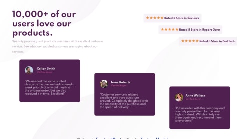
It was a good challenge for me XD. I didn't get used about using background-position and some things about positioning items on screen, and, I don't know why, but I feel I could write less code and have the same result or better. I don't know how can I duplicate the stars, I just used several images to do it and I think that it has a better way to do it. I accept advices, tips and construtive critics, feel free to comment and say what I can get better.
Code
Loading...
Please log in to post a comment
Log in with GitHubCommunity feedback
No feedback yet. Be the first to give feedback on Luis Gustavo Monteiro's solution.
Join our Discord community
Join thousands of Frontend Mentor community members taking the challenges, sharing resources, helping each other, and chatting about all things front-end!
Join our Discord