Solution retrospective
What are you most proud of, and what would you do differently next time?
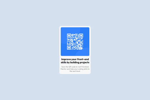
This is my first time using HTML and CSS. Just happy i was able to make it look like the preview.
not have any inline css in my html
What challenges did you encounter, and how did you overcome them?Figuring out how to get the qr code inside the rectangle and then round the corners. then formatting the font
Code
Loading...
Please log in to post a comment
Log in with GitHubCommunity feedback
No feedback yet. Be the first to give feedback on Lord-Zethes's solution.
Join our Discord community
Join thousands of Frontend Mentor community members taking the challenges, sharing resources, helping each other, and chatting about all things front-end!
Join our Discord