Design comparison
Solution retrospective
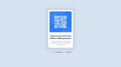
Hi, My second challenge so far. Curious to know how to write efficient HTML/CSS code. Feedback are welcome!
Community feedback
- @rohitd99Posted over 1 year ago
Hi kudos2Shef
Congrats on completing the challenge.
I noticed that to center the card you've used properties like
position : relative
etc on your card, well to center something you don't need these but simply use a flex or grid onmain
main { min-height: 100vh; display: flex; flex-direction: column; justify-content: space-around; align-items: center; }
add these to your solution and remove the
position : relative
andtop : 120px
from your card. Also I see you've used headings in the wrong way. The card title must he ah1
instead of anh3
. Each page must have a singleh1
heading for the title. Headings must be in order fromh1
throughh6
. Same for the footer instead ofh6
, I think semantically ap
element should suffice as I don't think that is a heading.Hope it helps
Marked as helpful0 - @azelalynetanPosted over 1 year ago
Good job! Nice work. My only suggestion is don't skip heading levels. For accessibility, it's recommended to use heading in a logical order. Keep it up.
0 - @A-pixel-uxPosted over 1 year ago
Bro nice work, There is no much comment on this you did a perfect job especially on the responsive part. I will just advice to keep on practicing, They normally say practice made perfect. Keep it up, Thumb ups for this once again.
0
Please log in to post a comment
Log in with GitHubJoin our Discord community
Join thousands of Frontend Mentor community members taking the challenges, sharing resources, helping each other, and chatting about all things front-end!
Join our Discord