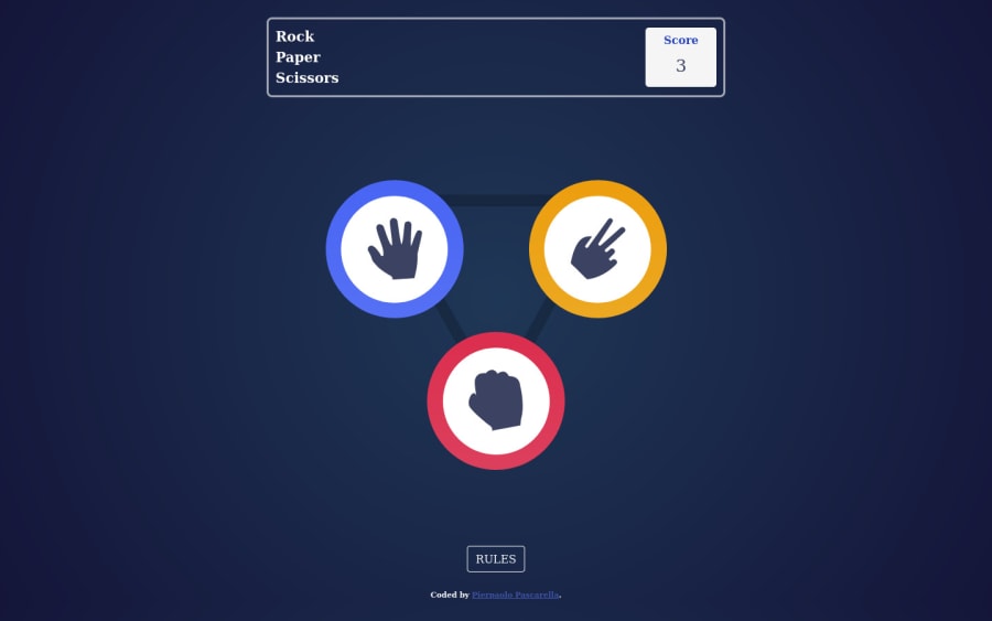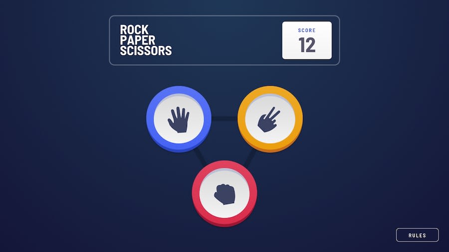
Design comparison
Solution retrospective
2cnd project completed, I'm very happy with the design, but I feel like alot of the JS code I wrote is very repetitive w/ creating alot of elements from within JS to show the final outcome,
I will try to stream line that code more so it can be more efficient, any comments welcome !
Community feedback
- @MojtabaMosaviPosted over 3 years ago
Take look at the following things:
1- There is alot of rum to improve the markup, writing semantic markup is all about chosing the right html elemen for the content contained within it. You use alot of div where there are much more semantic html elements.
2- This is only my a suggestion, make the result section a two row layout because at the moment they are stacked next to each other thightly.
Well done.
Keep coding :=)
0@Pierpaolo01Posted over 3 years ago@MojtabaMosavi
Thanks mate, I will defintely include more semantic tags in my project I think in the moment they don't come to mind so I just place a div haha
0 - P@palgrammingPosted over 3 years ago
The
You win You loosetext is not showing up the same place as theYou Tiednotification is. The you Win you Lose is showing up to the right of the game pieces and the Tied is showing up below the game pieces as it looks like they should0@Pierpaolo01Posted over 3 years ago@palgramming
I'm not quite sure what you mean, on my end all the "you win/lose/draw" texts are showing up at the bottom point of the triangle like I intended them too. Maybe you've loded an older commit from the GH Repo?
0P@palgrammingPosted over 3 years ago@Pierpaolo01 I checked it again the win or loose is showing up to the right of the two circles not in the triangle like the tie does
0
Please log in to post a comment
Log in with GitHubJoin our Discord community
Join thousands of Frontend Mentor community members taking the challenges, sharing resources, helping each other, and chatting about all things front-end!
Join our Discord
