Design comparison
Community feedback
- @lukejansPosted almost 2 years ago
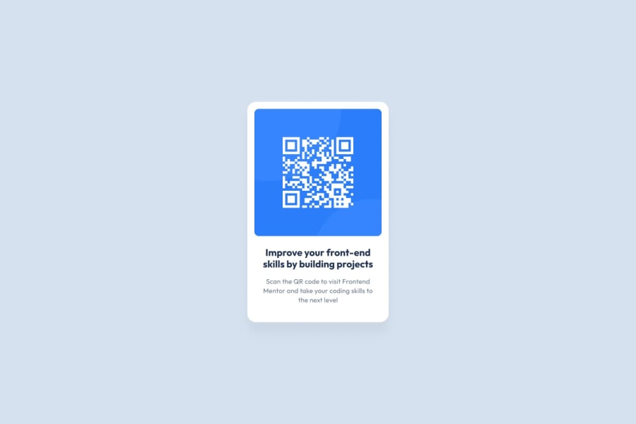
another thing to note would be that your border radii are not properly symmetrical which can make your QR Code look a little odd. To fix this you should apply a smaller border radius to the child as the radius will effect the two depending on their size.
1 - @lukejansPosted almost 2 years ago
Looks great!
One thing I've learned that I think you'll thank me for in the near future is to change the way you set your font. You should never be setting your font size in pixels as this is considered bad practice and not as accessible. When setting font size in pixels it does not allow the user to change the font in their browser settings making it difficult for ppl who need bigger font to read.
Instead try:
font-size: 1rem;which is 16px. You can use this tool to convert rem to pxhopefully this helps and happy coding!
1@TYTAN01Posted almost 2 years ago@lukejans I wish I had noticed it sooner because I made a project using px to set the font size. I won't do it again. I didn't think anyone would check/comment on my work. As for the border radius, it was a stupid mistake. Thank you for this valuable comment!
0
Please log in to post a comment
Log in with GitHubJoin our Discord community
Join thousands of Frontend Mentor community members taking the challenges, sharing resources, helping each other, and chatting about all things front-end!
Join our Discord
