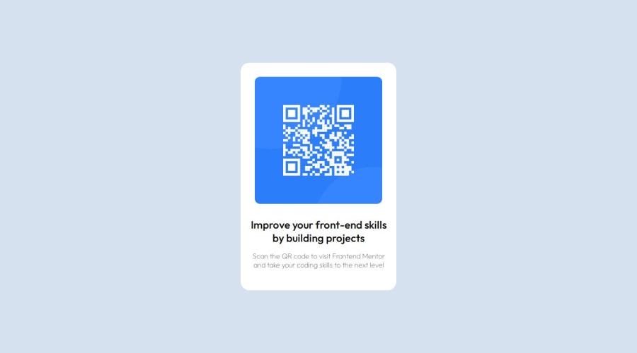
Design comparison
Solution retrospective
I am proud that I could successfully build this beginner project within 30 minutes and it affirmed me that I know the basics of HTML and CSS.
I would like to use more reusable CSS the next time.
What challenges did you encounter, and how did you overcome them?I could not center the card vertically at the beginning but could do it after a simple google search.
What specific areas of your project would you like help with?It would be great if I could get some guidance on writing well structured HTML and reusable CSS.
Community feedback
- @danielmrz-devPosted 4 months ago
Hello there!
Congrats on completing the challenge! ā
Your solution is really impressive!
I've got a couple of ideas (about how to use HTML better) that could make it even stronger:
š First: Think about using
<main>
to wrap your main content instead of<div>
.Imagine
<div>
and<span>
in HTML as basic containers. They're good for holding stuff, but they don't tell us much about what's inside or its purpose on the webpage.š Second: Consider using
<h1>
for your main title instead of<h2>
.It's more than just text size ā it's about structuring your content effectively:
- The
<h1>
to<h6>
tags are used to define HTML headings. <h1>
is for the most important heading.<h6>
is for the least important heading.- Stick to just one
<h1>
per page ā it should be the main title for the whole page. - And don't skip heading levels ā start with
<h1>
, then use<h2>
, and so on.
These tweaks might not change how your page looks, but they'll make your HTML code clearer and help with SEO and accessibility.
Hope that's helpful!
Keep up the great work!
Marked as helpful1@Siyam1888Posted 4 months ago@danielmrz-dev Thanks a lot for your very helpful feedback. As a beginner, it means a lot to me. I will definitely incorporate your feedback into my upcoming projects.
1 - The
- @MahmoodHashemPosted 4 months ago
Hello there! šš½āāļø
Well done on completing the challenge! ā
Your project looks fantastic!
Here's a helpful tip for you:
- When using an image in a container, you can make it responsive by setting the width to a percentage (in this case,
100%
) and adding padding to the card for spacing. There is no need to set width and height here
Updated code:
.qr-code{ width: 100%; /* Remove any other unnecessary code */ }
Hope you find this helpful!
Great job overall!
Marked as helpful0@Siyam1888Posted 4 months ago@MahmoodHashem Thanks a lot for your helpful feedback. I will surely apply this method in my upcoming projects.
1 - When using an image in a container, you can make it responsive by setting the width to a percentage (in this case,
Please log in to post a comment
Log in with GitHubJoin our Discord community
Join thousands of Frontend Mentor community members taking the challenges, sharing resources, helping each other, and chatting about all things front-end!
Join our Discord