HTML, CSS, FLEXBOX , MOBILE FIRST, GIT, BEM
Design comparison
Solution retrospective
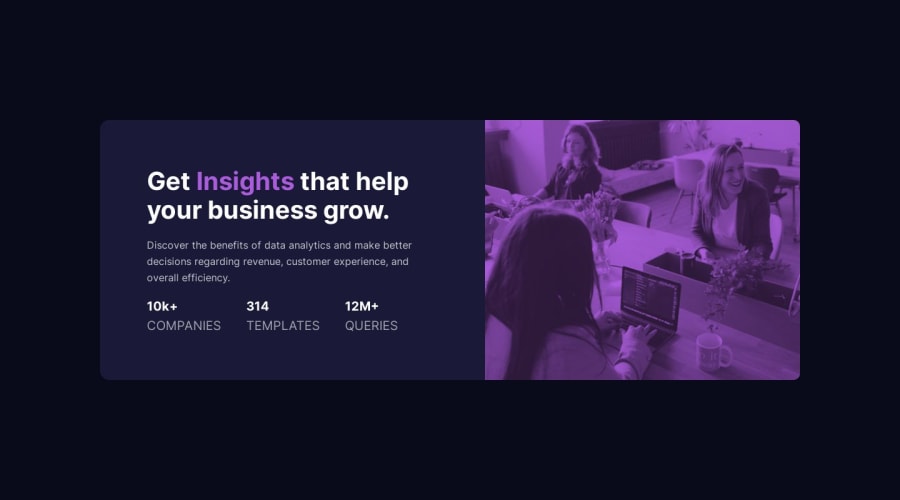
-Because I couldn't have control over the height of the background-image I decided to change it to the img tag in the html, thus achieving a better design on different devices -add the min-height so that content is not cut when it is smaller -I used the main, h1 , p tags instead of the div tag for better accessibility.
I await your comments and what could I improve more. =)
Community feedback
- @correlucasPosted about 2 years ago
👾Hello JuniorQuin, Congratulations on completing this challenge!
You’ve done really good work here putting everything together, I’ve some suggestions to improve the design:
You need to fix the
container sizethat is a bit off, this challenge uses the standard container size that ismax-width: 1110px.To make the image have a better fit inside of it, make the component image responsive with
display: blockandmax-width: 100%(this makes the image fit the column/div size) and respect the component size while it scales down. To make it crop while scaling useobject-fit: cover.img { display: block; object-fit: cover; max-width: 100%; }The way you’ve applied the purple color is fine, but if you want the exact color tone of color of the challenge designs, you need to use
mix-blend-modeto make the color blend between the image and the background-color of the container. See the steps below to apply to theimgorpictureselector:img { mix-blend-mode: multiply; opacity: 75%;}✌️ I hope this helps you and happy coding!
Marked as helpful0 - @denieldenPosted about 2 years ago
Hi Juniorquin, congratulations on completing the challenge, great job! 😁
Some little tips for optimizing your code:
- add
maintag and wrap the card for improve the Accessibility - use
h1element for the title and not adiv. You can usespantag with class to change color of word - use
pelement for the text and not adiv - use
min-height: 100vhto body instead ofheight, otherwise the content is cut off when the browser height is less than the content - instead of using
px or %use relative units of measurement likerem-> read here
Hope this help! Happy coding 😉
Marked as helpful0 - add
- @PPechmannPosted about 2 years ago
Hola Junior!
Very well done on your first challenge here on FrontendMentor, good job!
Regarding the BEM Methodology: You did apply it correctly, although the class names can get a bit confusing, as they seem too long.Try to keep it as short as possible. For example: Instead of
.card-componente__descripcion__estadisticaand.card-componente__descripcion__resumen, use:card__estadisticaandcard__resumen. Basically, you should usesomething__block, for standalone elements andsomething__block--modifier, for modifiers such as buttons with different stylings, for example. Here you will find a very in detail guide.The image: It is already very well positioned, I would only leave it at
background-position: center, instead ofcenter top.Further adjustments: I would also recomment giving the
card-componente__descripcionsome padding and lower the font-size, to get it closer to the initial design.I hope my quick feedback is helpful and look forward to more of your solutions!
Happy Coding :)
Patrick
Marked as helpful0
Please log in to post a comment
Log in with GitHubJoin our Discord community
Join thousands of Frontend Mentor community members taking the challenges, sharing resources, helping each other, and chatting about all things front-end!
Join our Discord
