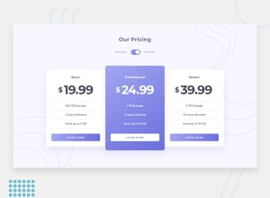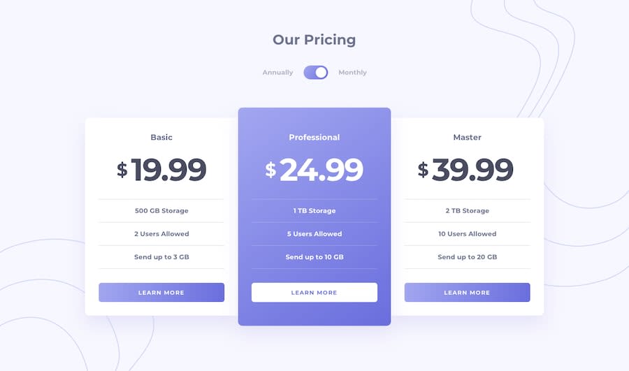
Design comparison
SolutionDesign
Solution retrospective
Feedbacks appreciated.
Community feedback
- @palgrammingPosted over 3 years ago
Looks good but as you can see in the screenshot comparison above your desktop layout is much smaller than the goal layout size
0@parmeet9891Posted over 3 years ago@palgramming Yeah, but why that so? Do I need to define the max-width for every card?
0@palgrammingPosted over 3 years ago@parmeet9891 it seems like you need to establish a width and height for your cards in the desktop layout
0
Please log in to post a comment
Log in with GitHubJoin our Discord community
Join thousands of Frontend Mentor community members taking the challenges, sharing resources, helping each other, and chatting about all things front-end!
Join our Discord
