Design comparison
Solution retrospective
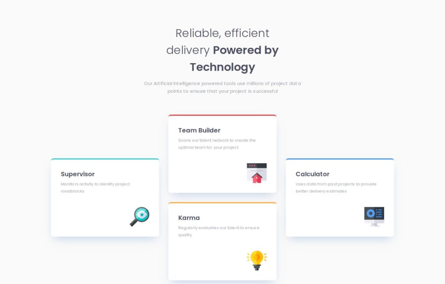
Meu maior desafio foi nos cards, tentei usar grid mas nao obtive exito, consegui deixar igual o Figma usando flexbox
What specific areas of your project would you like help with?Gostaria de ajuda nos cards se tem algum jeito melhor de desenvolver
Community feedback
- @lazydroidePosted 6 months ago
Pretty good solution, you use semantic html, variables, mobile first, etc. Two small details to improve, your karma and calculator cards are in wrong position, and the colored part of the cards is not a border-top (they have no curvature). You can make them straights with a linear-gradient.
In any case, great job.
0
Please log in to post a comment
Log in with GitHubJoin our Discord community
Join thousands of Frontend Mentor community members taking the challenges, sharing resources, helping each other, and chatting about all things front-end!
Join our Discord
