html, css, flexbox, js, mobile-first, media-queries
Design comparison
Solution retrospective
Hi, I'd love to know what you think about my integration. I'm not really used to use javascript in "real projects". I also tried to code for mobile, and then add media queries for desktop, is this the good way ?
Thanks !
Community feedback
- Account deleted
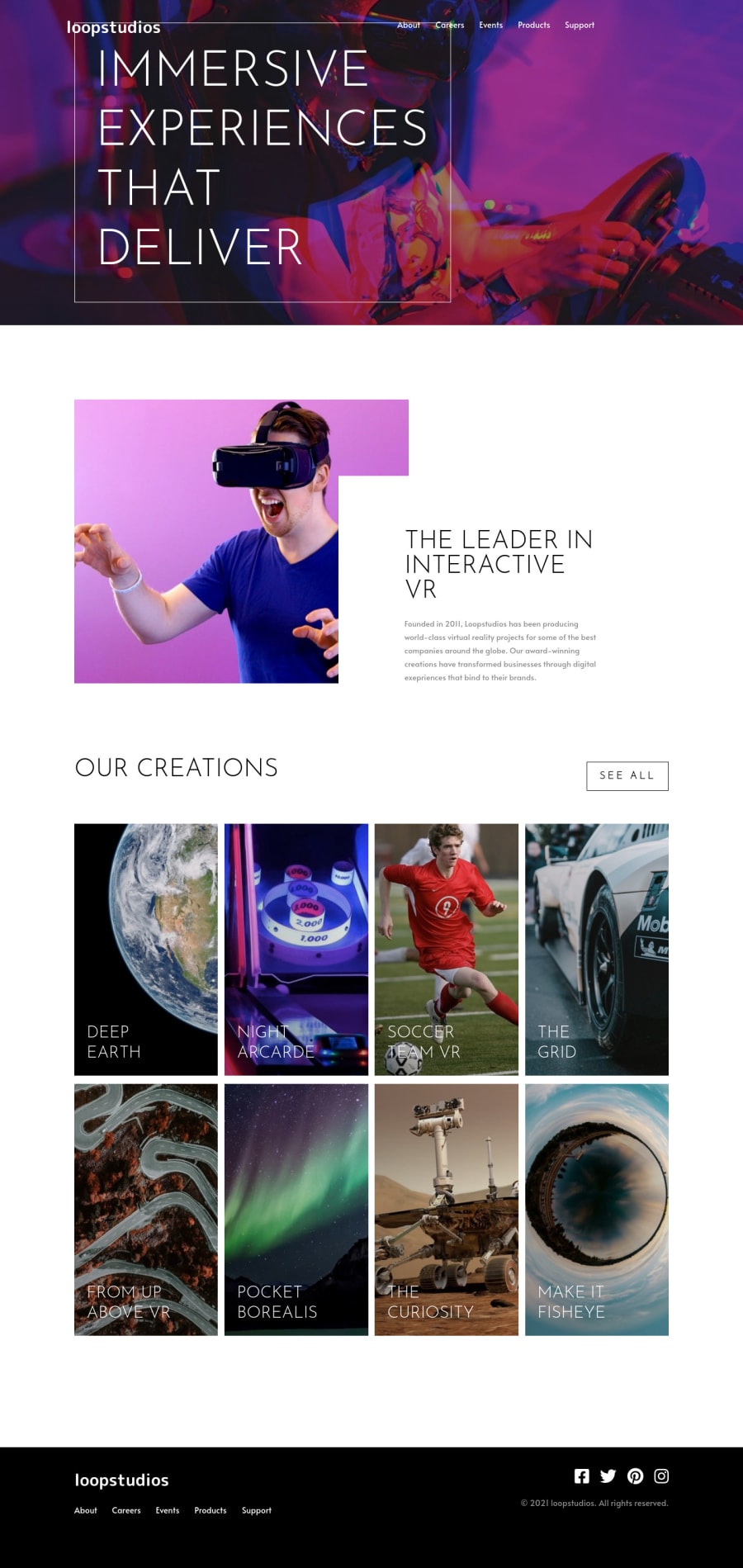
On my screen the 'immersive experience...' is on top of the navigation bar, and the photos have no spacing between them.
Marked as helpful1 - @MojtabaMosaviPosted almost 4 years ago
Hi, your solution looks good and responds well, The quite a few small sublte things that you can take your solution to next level.
-
Adjust the font size of hero title on desktop view.
-
Whenever there is a specific tag for a certain taks use it because it makes your markup more semantic, for example about-img you should use an image tag instead of div.
-
For you media queries try to use relative units either rem or em, I recomand you use ems because it improves the responsibility of you solution across different browsers.
-
The icons in the footer are missing the underline.
Keep coding :)
Marked as helpful0 -
- Account deleted
You can Also check the report for some html issues.
0 - Account deleted
That's Great. I like it 😍.. You can do a transition for photos when hover.. and check the font-size .
0
Please log in to post a comment
Log in with GitHubJoin our Discord community
Join thousands of Frontend Mentor community members taking the challenges, sharing resources, helping each other, and chatting about all things front-end!
Join our Discord
