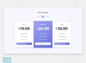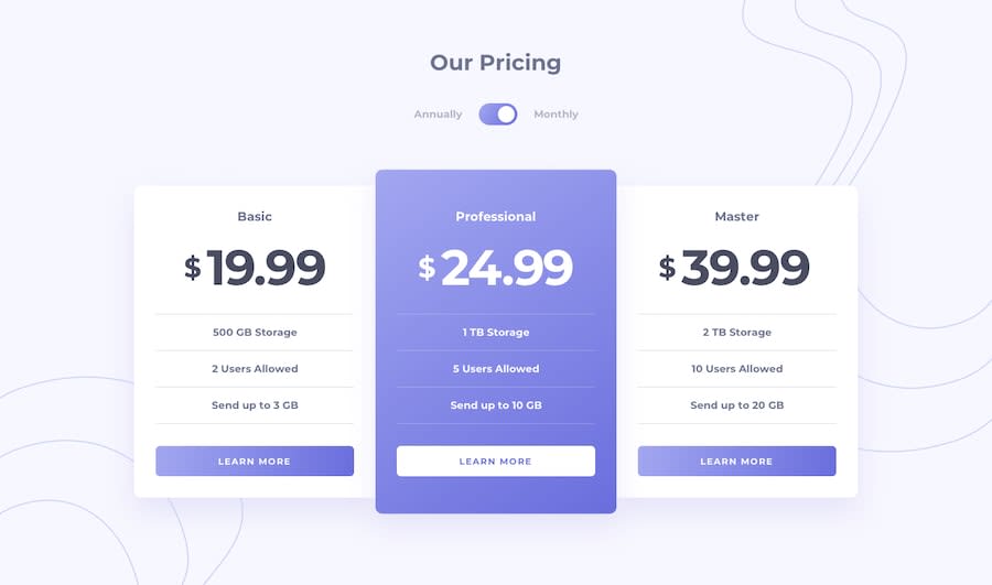
Design comparison
SolutionDesign
Solution retrospective
Hi everyone, hope you like it and thanks for some tips! 👨💻💪
Community feedback
- @ApplePieGiraffePosted almost 4 years ago
Hey, Xavier Guzman! 👋
Nice to see you complete another challenge! Good work on this one! 👍
Those intro animations are cool and the hover states of the buttons are certainly very interesting! 😎
I suggest,
- Making the toggle-switch tabbable so that keyboard users can access and use the toggle.
- Making sure the headings of the pricing cards don't become too small in the mobile layout (they should remain a little bigger than the body copy [as in the original design] to visually highlight them around the rest of the text). 😉
Keep coding (and happy coding, too)! 😁
0
Please log in to post a comment
Log in with GitHubJoin our Discord community
Join thousands of Frontend Mentor community members taking the challenges, sharing resources, helping each other, and chatting about all things front-end!
Join our Discord
