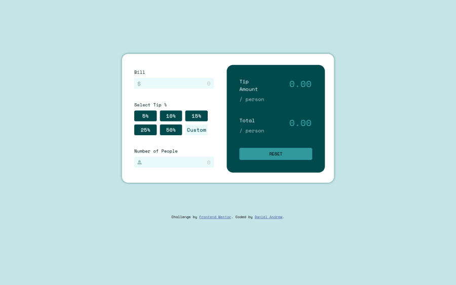
Submitted over 3 years ago
HTML, CSS, Flexbox, Grid, Vanilla JavaScript
@DxnielXndrew
Design comparison
SolutionDesign
Solution retrospective
All thoughts, tips, and criticism is welcome. Still some things to optimize
Community feedback
- @ChamuMutezvaPosted over 3 years ago
- validate for negative numbers as well.
Other than that everything looks ok to me. Well done
Marked as helpful1 - @hafizanadliPosted over 3 years ago
I think you have to set active color for tip button, to show which tip amount that user currently choose
great work!
Marked as helpful0
Please log in to post a comment
Log in with GitHubJoin our Discord community
Join thousands of Frontend Mentor community members taking the challenges, sharing resources, helping each other, and chatting about all things front-end!
Join our Discord
