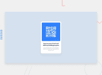
Design comparison
Solution retrospective
What I found difficult was having the divs overflowing when creating a certain width and height for the main div. I would like to know what a simple approach is to correcting certain heights and widths for responsive web design.
Is there a structure that people go by to customize a certain width and height. How close am I to the correct solution that is given.
I am unsure of the mobile design as I have not really studied how to create mobile designs.
What is best practices for creating widths and heights in CSS.
Community feedback
- @MelvinAguilarPosted 10 months ago
Hello there 👋. Good job on completing the challenge !
I have some suggestions about your code that might interest you.
HTML 🏷️:
- Use the
<footer>tag to wrap the footer of the page instead of the<div class="attribution">. The<footer>element contains information about the author of the page, the copyright, and other legal information.
CSS 🎨:
-
For a responsive and resizable component, consider using
max-width: 320pxormax-width: 20remfor the width and addingmarginto avoid border touching the border of the screen in mobile devices. Also, remove the large padding in the text elements (/*padding: 0 5em;*/) -
The color of the paragraph element is unreadable because it is too light compared to its background. For example, change the color to
hsl(220deg, 15%, 55%). -
To center the component in the page, you should use Flexbox or Grid layout. You can read more about centering in CSS here 📘.
I hope you find it useful! 😄 Above all, the solution you submitted is great!
Happy coding!
Marked as helpful1@cloudpc7Posted 10 months ago@MelvinAguilar
thank you very much for the insight. I did another one and improved upon the feedback. Thank you
0 - Use the
- @danielmrz-devPosted 10 months ago
Hello @cloudpc7!
Your solution looks great!
I have a couple of suggestions for improvement:
- For semantic reasons, and since that is the main title of the project, you can replace the
<h2>with<h1>.
The
<h1>to<h6>tags are used to define HTML headings.<h1>defines the most important heading.<h6>defines the least important heading. Only use one<h1>per page - this should represent the main heading/subject for the whole page. Also, do not skip heading levels - start with<h1>, then use<h2>, and so on.- Also, I noticed that you used
marginto place the card in the middle of the page. Here's a very efficient way to center the card that adapts better with screen size changes:
You can apply this to the body (in order to work properly, you can't use position or margins):
body {
    min-height: 100vh;
    display: flex;
    justify-content: center;
    align-items: center;
}
I hope it helps!
Other than that, great job!
0@cloudpc7Posted 10 months ago@danielmrz-dev
thank you very much for the insight. I did another one and improved upon the feedback. Thank you
0 - For semantic reasons, and since that is the main title of the project, you can replace the
Please log in to post a comment
Log in with GitHubJoin our Discord community
Join thousands of Frontend Mentor community members taking the challenges, sharing resources, helping each other, and chatting about all things front-end!
Join our Discord

