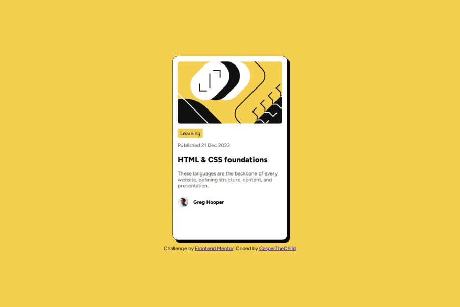
Html, CSS Flexbox, CSS transition, Google fonts.
Design comparison
Solution retrospective
I'm proud of exploiting variables.
What challenges did you encounter, and how did you overcome them?I had some challenges using 'em' and 'rem' when trying to define font sizes and shapes.
What specific areas of your project would you like help with?"I don't know why my code doesn't center the 'attribution' element when the width is less than 500px. Is my semantics correct? When I tried: "css body { display: grid; place-items: center; }" the 'attribution' was positioned too far down. I couldn't solve it.
Also, how can I set the card's width more effectively, other than using width: 30vw?"
Community feedback
- @hamzafrontendPosted 7 months ago
Use text-align: center; on .attribution class.
Marked as helpful0 - @KaustubhMaladkarPosted 7 months ago
Can you elaborate on what you mean by exploiting variables?
0@CasperTheChildPosted 7 months ago@KaustubhMaladkar I mean, 'I'm proud of using variables for the first time.'
0
Please log in to post a comment
Log in with GitHubJoin our Discord community
Join thousands of Frontend Mentor community members taking the challenges, sharing resources, helping each other, and chatting about all things front-end!
Join our Discord
