Design comparison
SolutionDesign
Solution retrospective
Any feedback is welcome
Community feedback
- @molszewski34Posted about 3 years ago
Hey Justyna
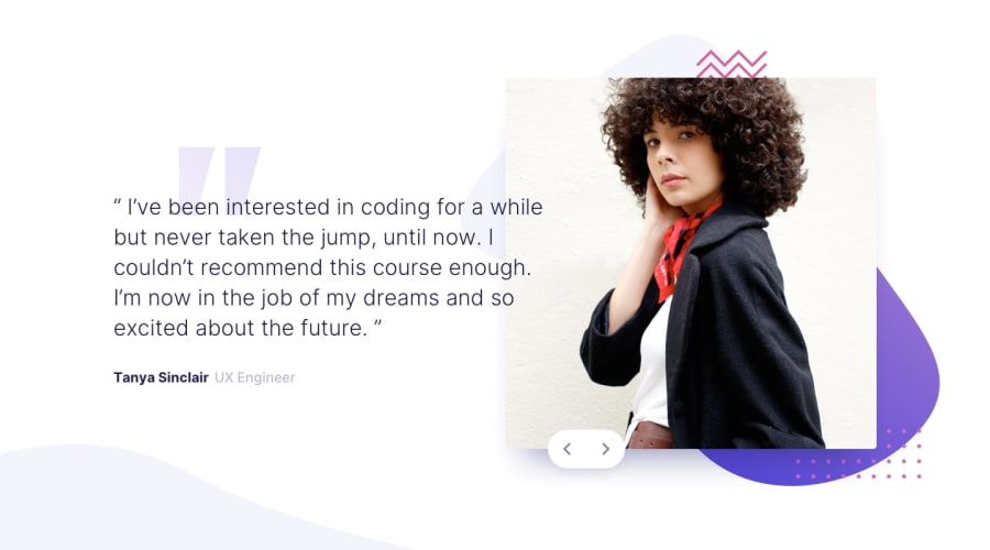
I spoted few problems. Both views are not so responsive and easy to make app totaly unclear. When i try to change resolution a bit down text moves over image making text unreadeable and image almost not visible. I manage this problem using clamp over font and min max pictures.
In mobile view button is not attached to image which makes it flow to center. Try to make buttons as element of image container and give them position absolute.
Good job in solving js part. Good luck.
Marked as helpful0@JustynaPrusPosted about 3 years ago@molszewski34 thank you, that's true - I will work on it
0 - @PiotrKukuc12Posted about 3 years ago
hi
- set "box. {right: 10vh} (or less), picture on design is more on right side
- box has two positions relative and absolute there should be one
- cursor: pointer for buttons, buttons should be more on right side of the picture as it is on design,
- colors that are repetitive can be stored as variable in root
Marked as helpful0
Please log in to post a comment
Log in with GitHubJoin our Discord community
Join thousands of Frontend Mentor community members taking the challenges, sharing resources, helping each other, and chatting about all things front-end!
Join our Discord
